2024
Leading IoT Brand (under NDA)
View prototype
What we achieved
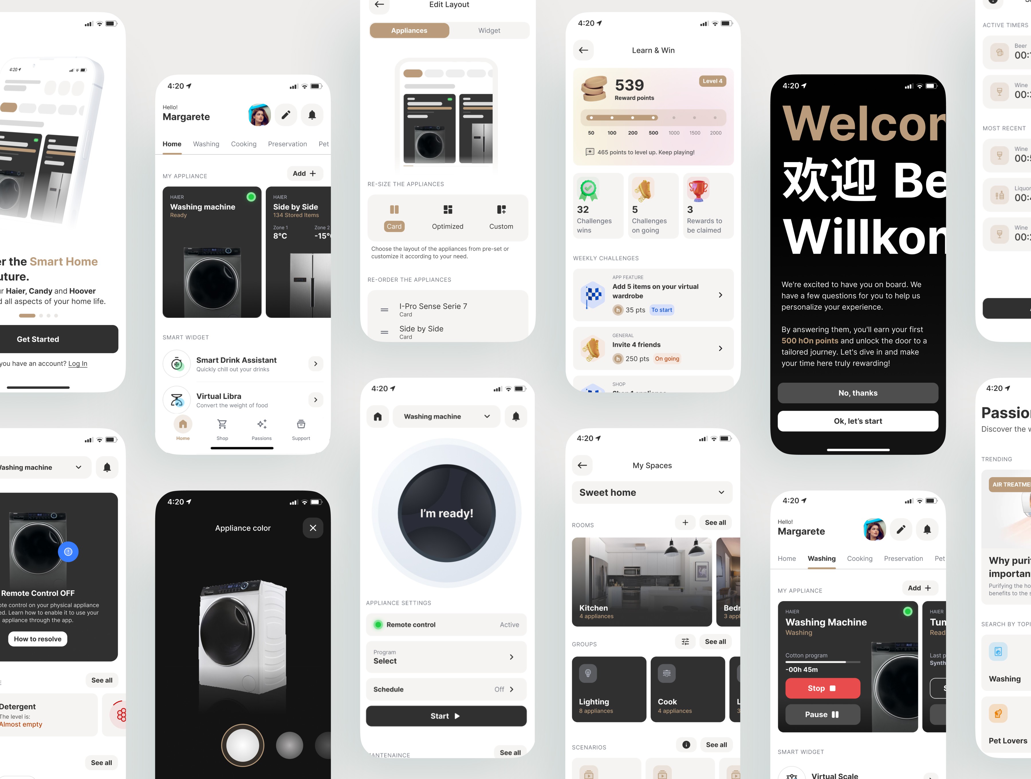
I led the redesign proposal of a smart home app with over 3 million users, helping the client reposition in the premium market and evolve the product into a smart home ecosystem, not just a control tool.
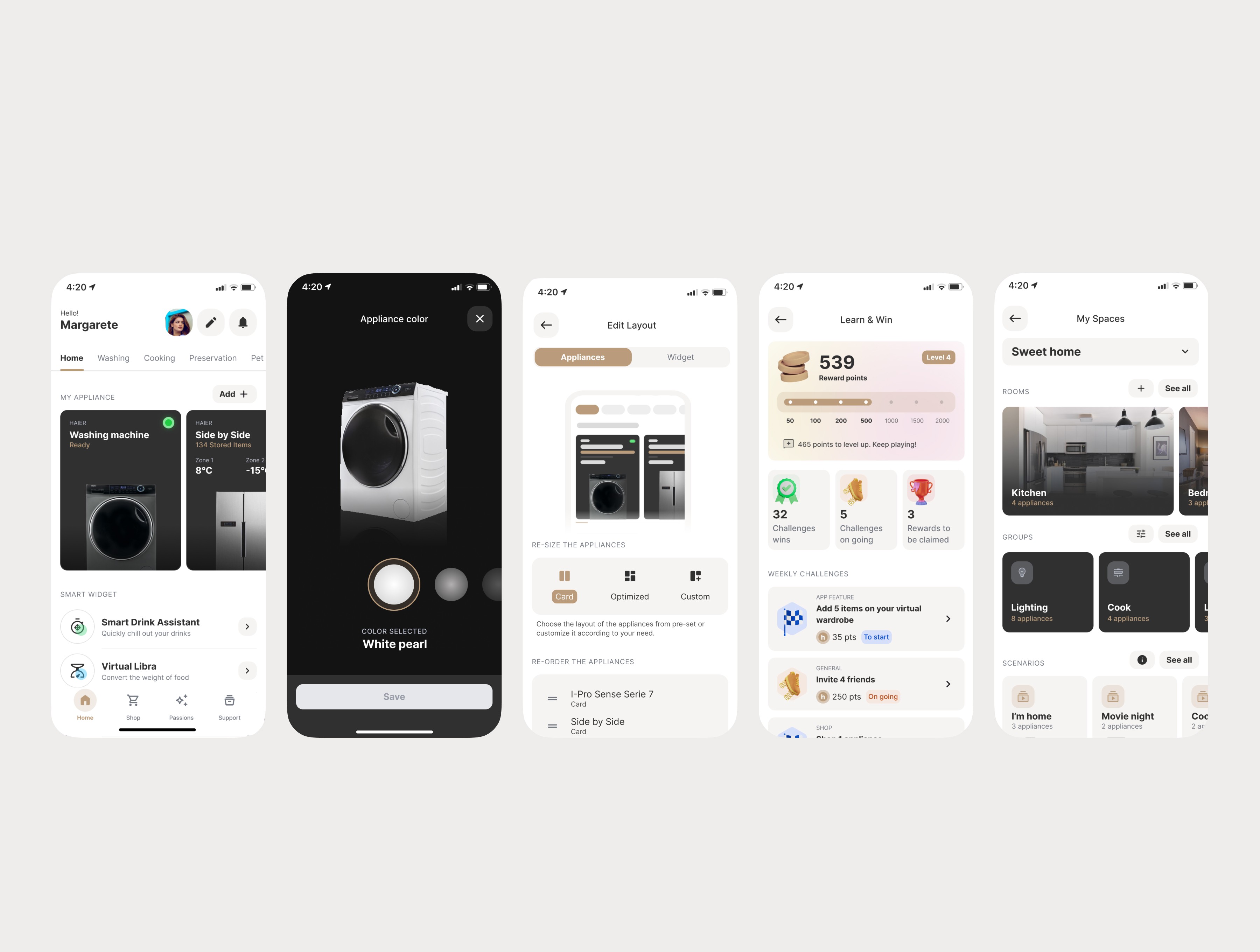
The new experience featured a refined visual identity, appliance-focused UI, and UX improvements like guided onboarding, personalization and gamification.
We tested the interactive prototype with real users and iterated the design based on feedback to ensure clarity, engagement, and scalability. View the prototype
My role in the journey
UX/UI Designer responsible for the entire redesign proposal
Involved in UI development, prototype building, and usability testing
Collaborated with internal stakeholders and research team during user testing phases
Tools: Figma, Miro
Where we started
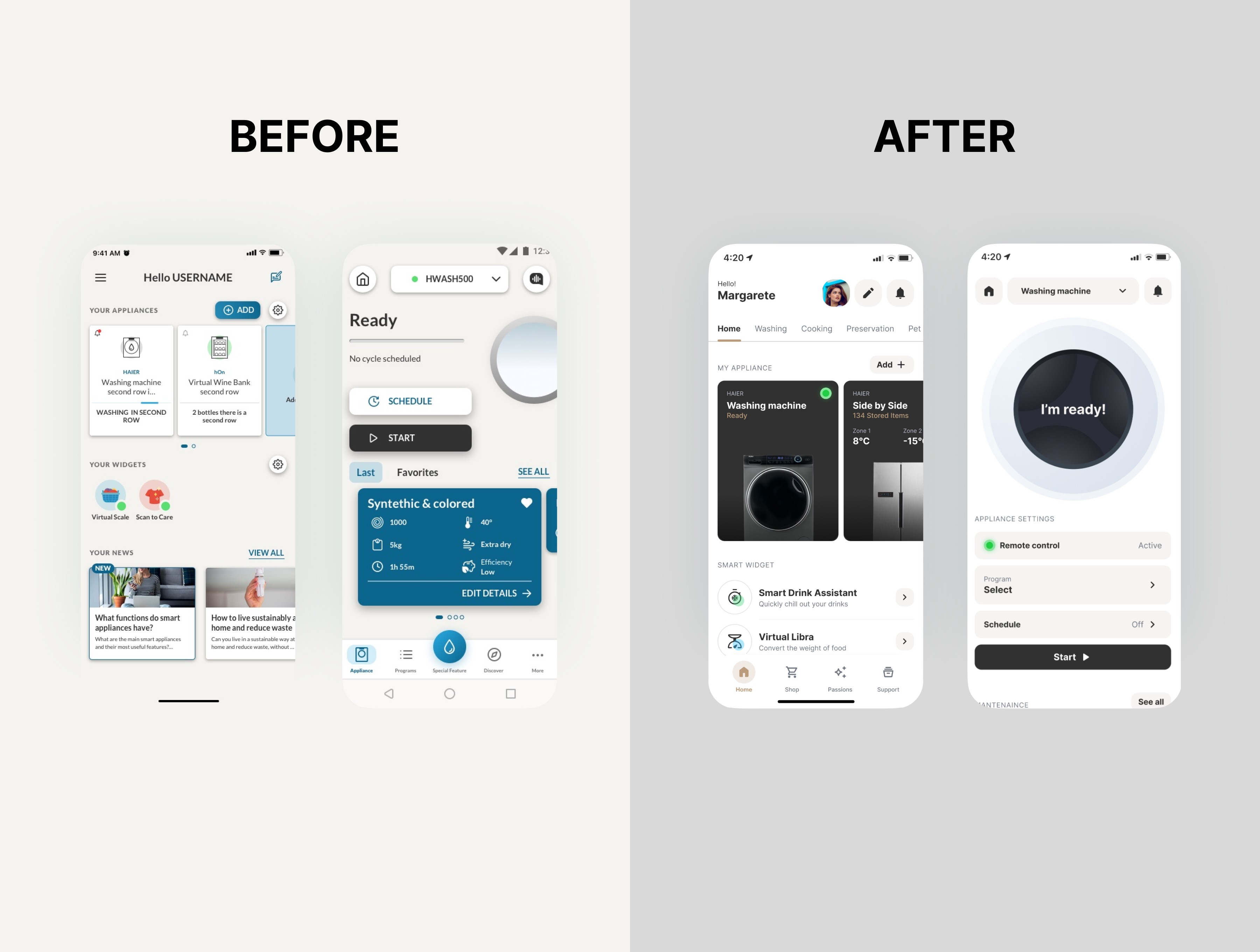
The existing interface felt outdated and lacked emotional engagement. The challenge was to create a modern visual identity and rethink key UX areas, while also maintaining clarity and usability for a wide range of users.
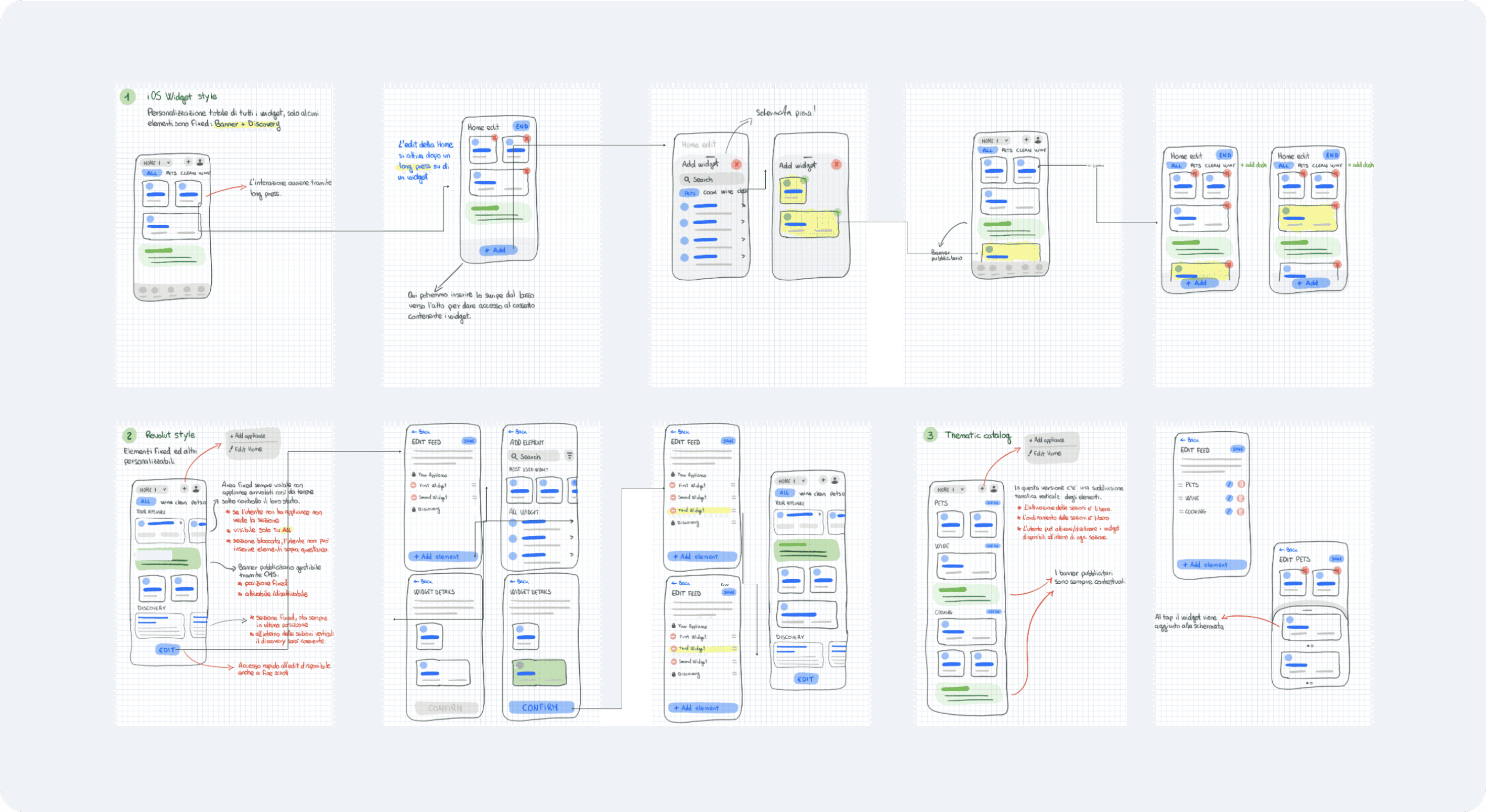
The process - Phase 1
Hand-Sketched Concepts Informed by Benchmarking
We started with a cross-industry benchmark, analyzing both IoT smart home apps and tech products with effective dashboards, like banking apps.
From these insights, I developed hand-sketched concepts to explore layout, hierarchy, and interactions — focusing on clarity, quick access to key appliances.
The process - Phase 2
Visual Design
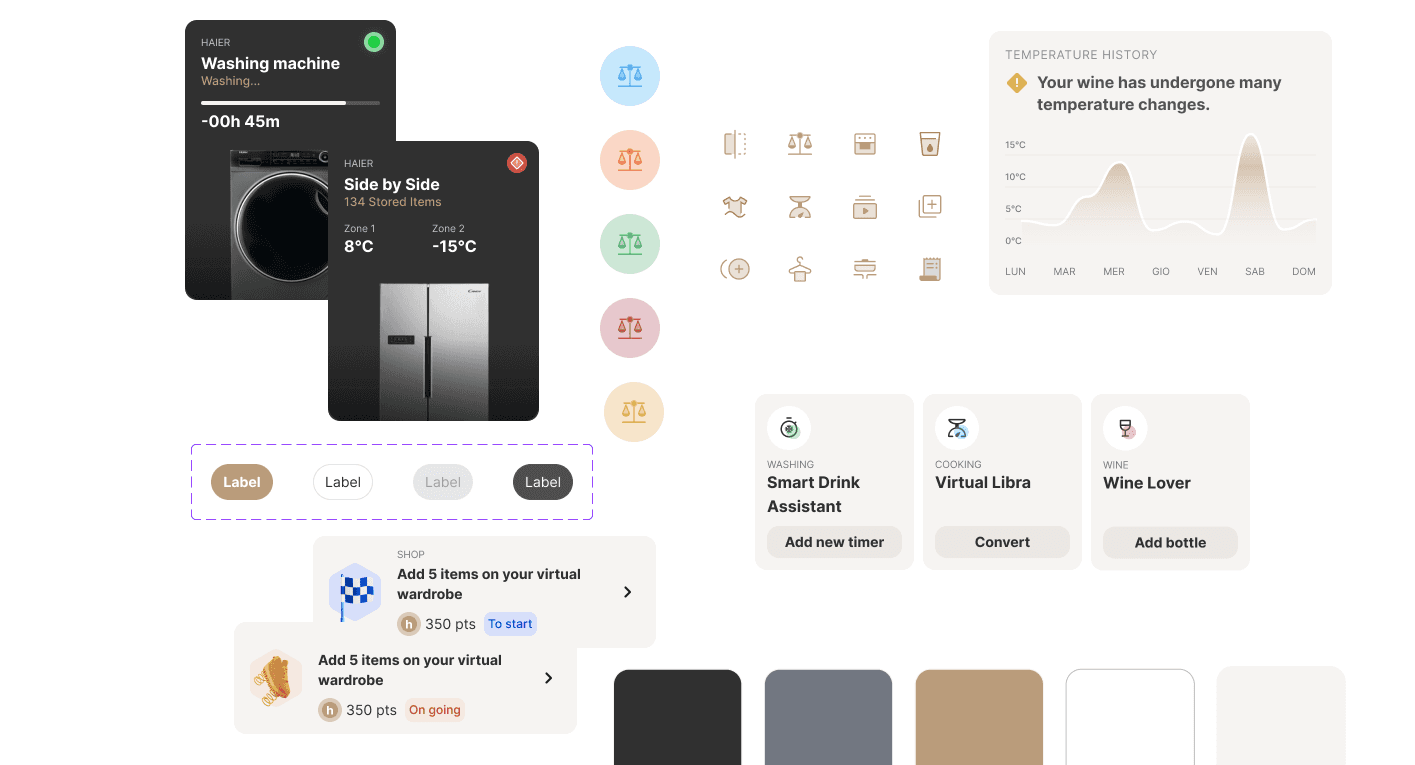
We proposed a new visual identity featuring:
A more elegant and minimal color palette
A bespoke icon set for smart devices
Enhanced focus on product imagery to drive emotional engagement
The process - Phase 3
Turning Functions into Experiences
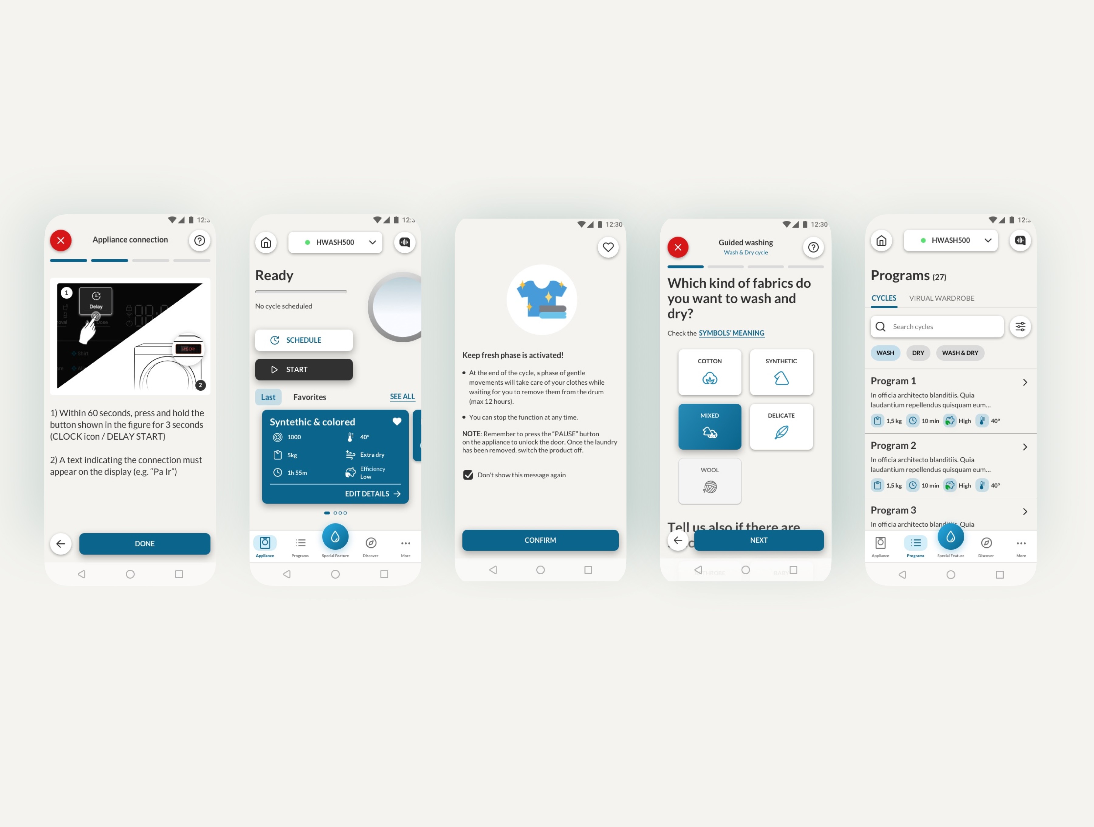
The redesign aimed to deliver a more intuitive and premium experience around a centralized device hub.
We replaced illustrations with real product imagery to enhance recognition and emotional engagement. To elevate the app further, we explored user personalization and advanced smart home features such as routines, room/group management, and contextual scenarios — shaping a smarter ecosystem, not just a control panel.
The process - Phase 4
Usability Testing
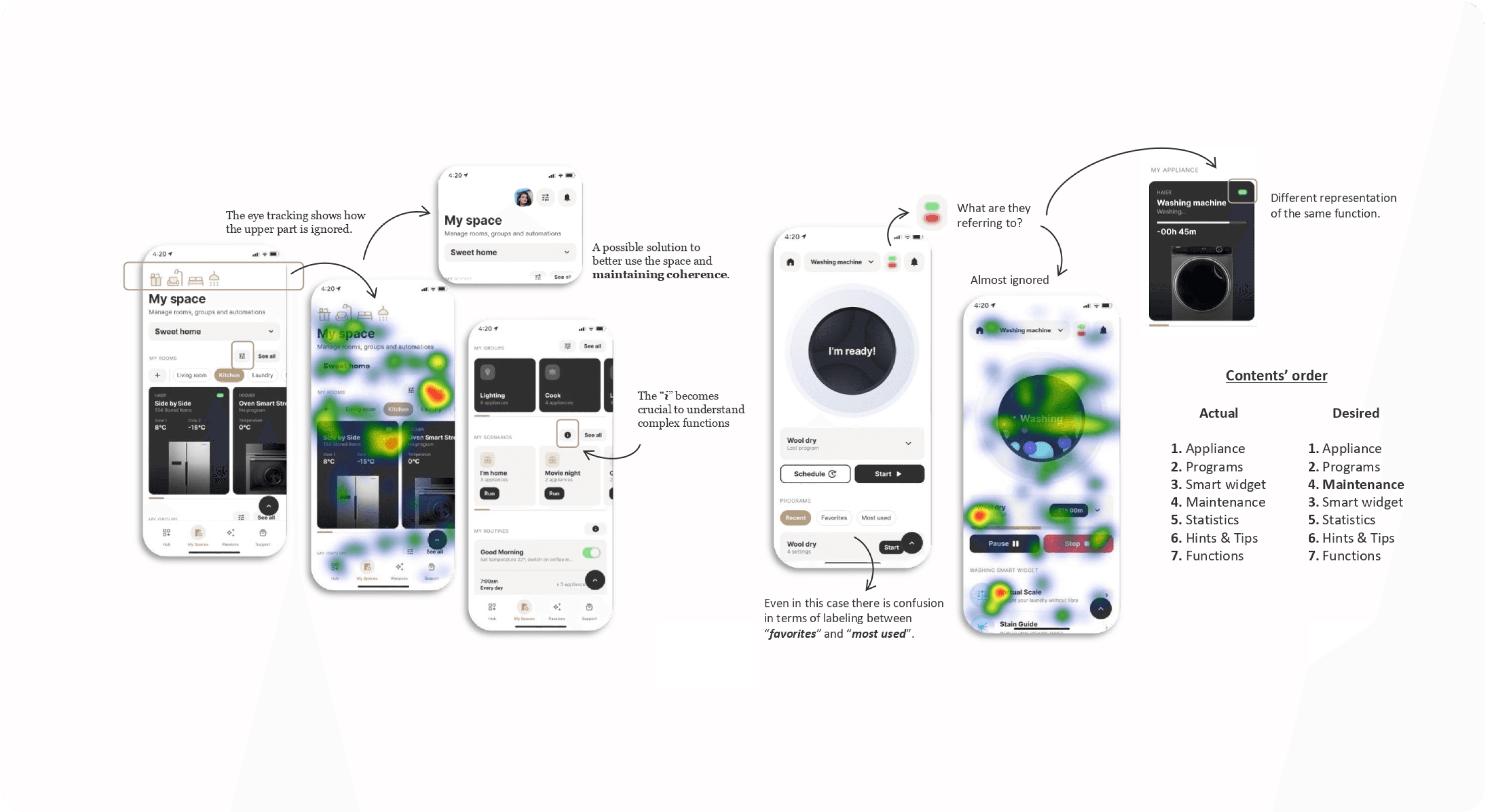
To validate our design, we ran in-person usability tests with a dedicated research lab and 10 existing users of the current app. I co-designed the test scenarios and observed the sessions, supported by eye-tracking technology to capture attention patterns and UI scan behaviors.
Key findings:
Users found the new UI cleaner and easier to understand
Real imagery drew more attention than icons or illustrations
Onboarding and coachmarks improved orientation, especially for new users
70% understood gamification logic immediately; others flagged naming issues
9 out of 10 completed the appliance control flow successfully
These insights led to refinements in visual hierarchy, microcopy, and interaction clarity before development.
The process - Phase 5
Iteration & Rework
We used the feedback to refine layouts, adjust labels, and clarify some UI elements. The final proposal was a more balanced mix of elegance, control, and brand alignment.
What changed
🧠 Clearer mental model
Onboarding and contextual cues helped users better understand how to navigate and interact with the app.
💎 A premium look, finally matching the brand
The new visual identity — real imagery, elegant UI, and polished microcopy — aligned the app with the brand’s luxury positioning.
⚡ Faster, smoother interactions
Key flows like appliance control and personalization became more efficient, reducing friction and hesitation.
🧪 Decisions backed by real users
Prototype testing gave us confidence before rollout, grounding the design in real behavior — not assumptions.
What I learned
This project was a deep dive into how visual design directly influences perceived brand value. Creating a luxury-feeling interface without compromising usability was the core challenge.
Testing with real users made a huge difference in validating design decisions — a reminder that data-driven creativity leads to stronger outcomes. View the prototype