2024
Leading IoT brand (under NDA)
View prototype
What we achieved
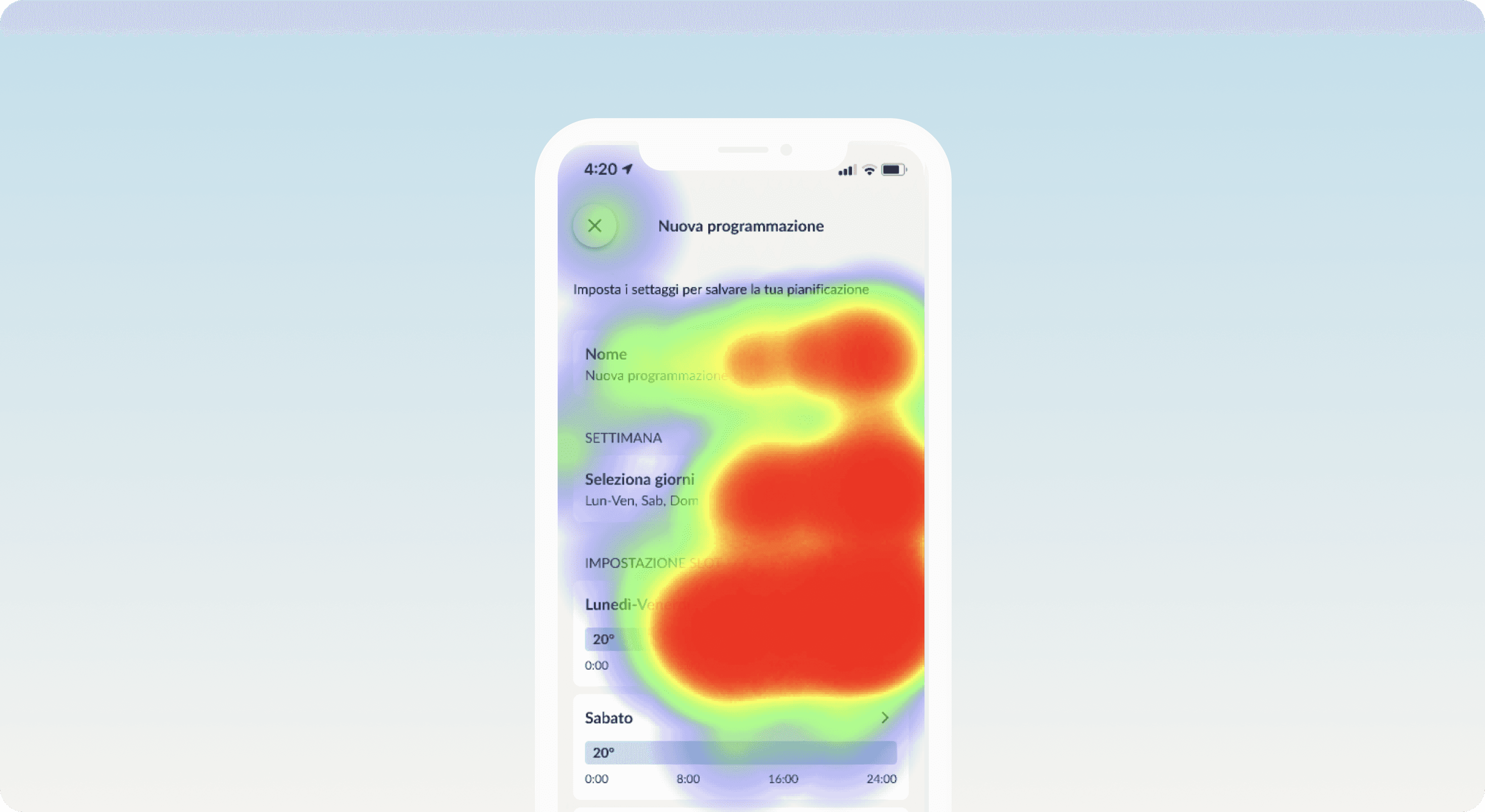
We designed and tested a new scheduling experience for Air to Water (ATW), a device that controls home heating and cooling via room-based thermostats.
Due to the complexity of the flow, we created two UX variations and ran an A/B test with real users. This allowed us to identify the best solution before release, shaping a final design that now includes both a standard and a guided scheduling mode. View the prototype
My role in the journey
UX/UI Designer: designed the full experience from flow mapping and hand sketches to high-fidelity UI and interactive prototypes for both test versions.
Testing Analyst: set up the Maze A/B test, analyzed reports and session recordings, and mapped insights to guide the final iteration.
Tools: Figma, Maze, Miro
Where we started
We began by defining the complete user flow for the ATW scheduling feature. During this phase, it became clear that the number of variables and technical limitations of the ATW appliance introduced a level of complexity that could easily overwhelm users.
Instead of committing to a single UX direction too early, we proposed to the client to explore two different approaches and validate them through a structured A/B test with real users.
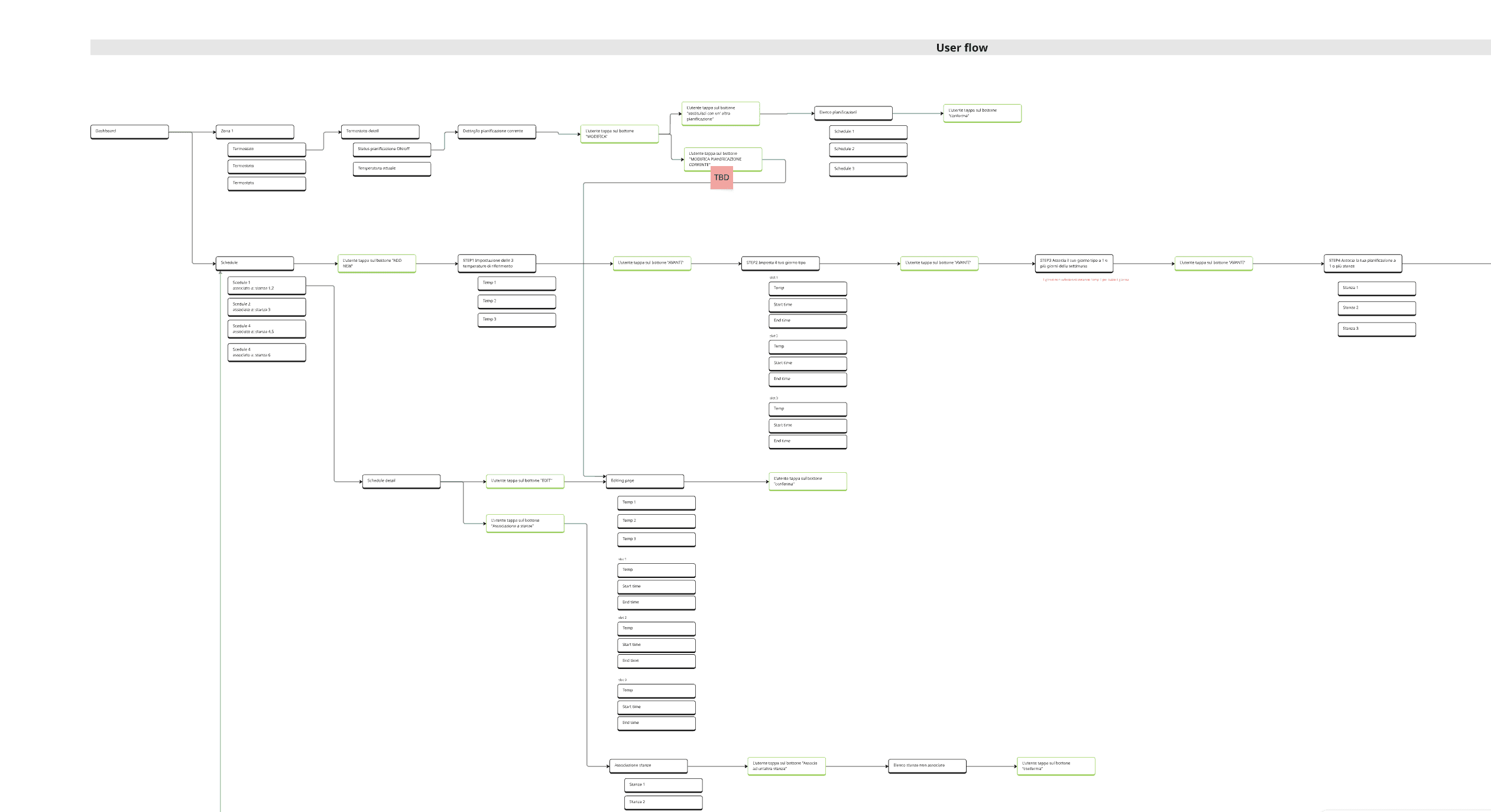
The process - Phase 1
Defining two UX approaches
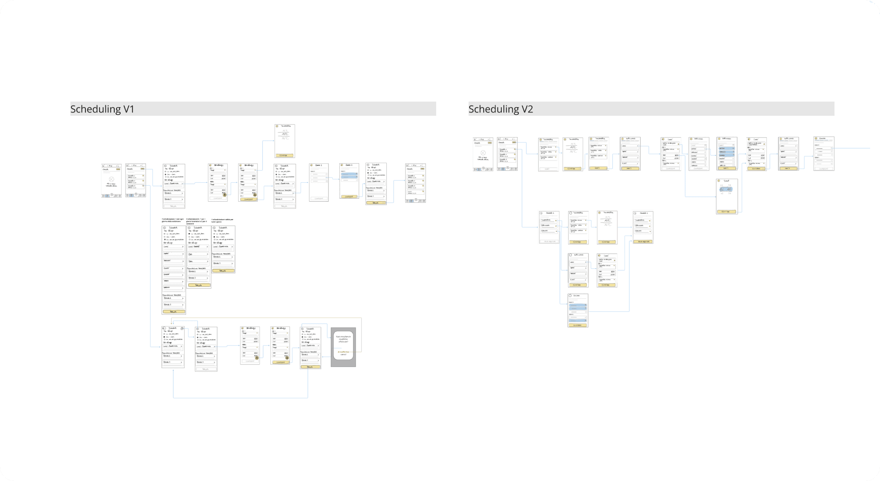
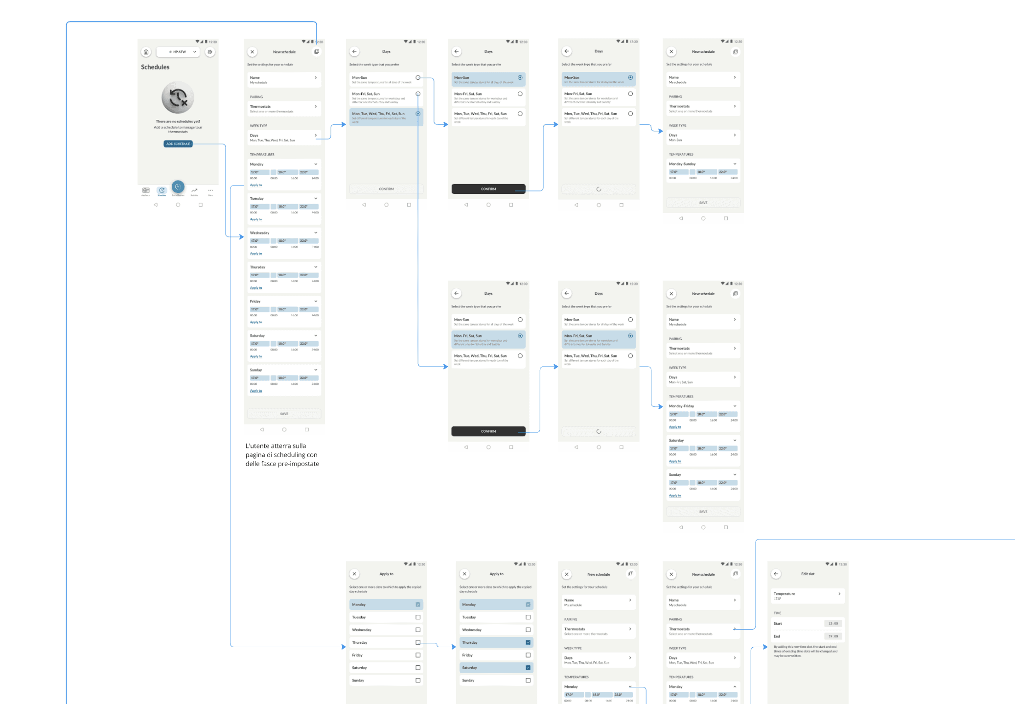
We designed Version A and Version B with different structural logics and interaction patterns for managing ATW programs. One focused on step-by-step guidance, the other on fast access and flexibility.
The process - Phase 2
Prototyping two experiences
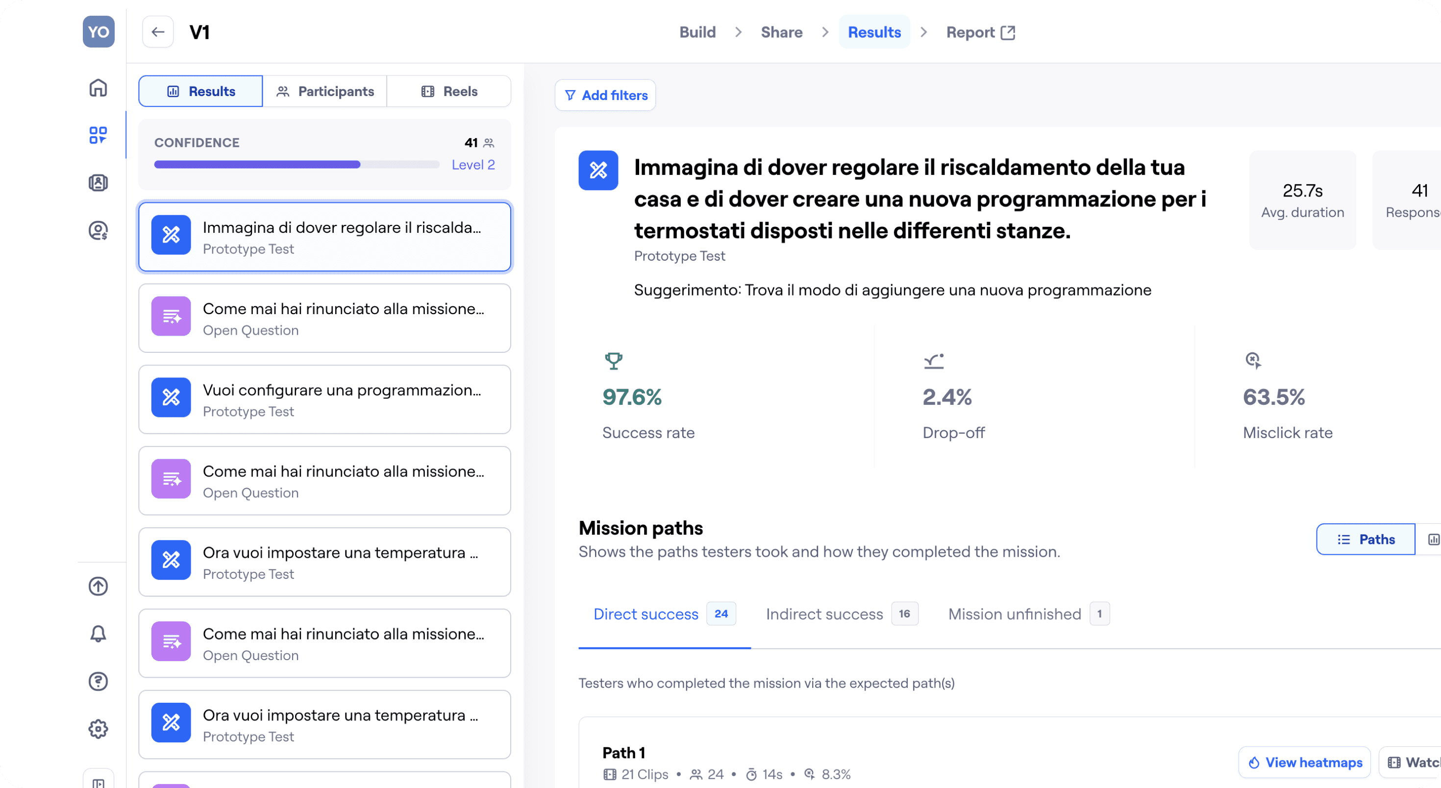
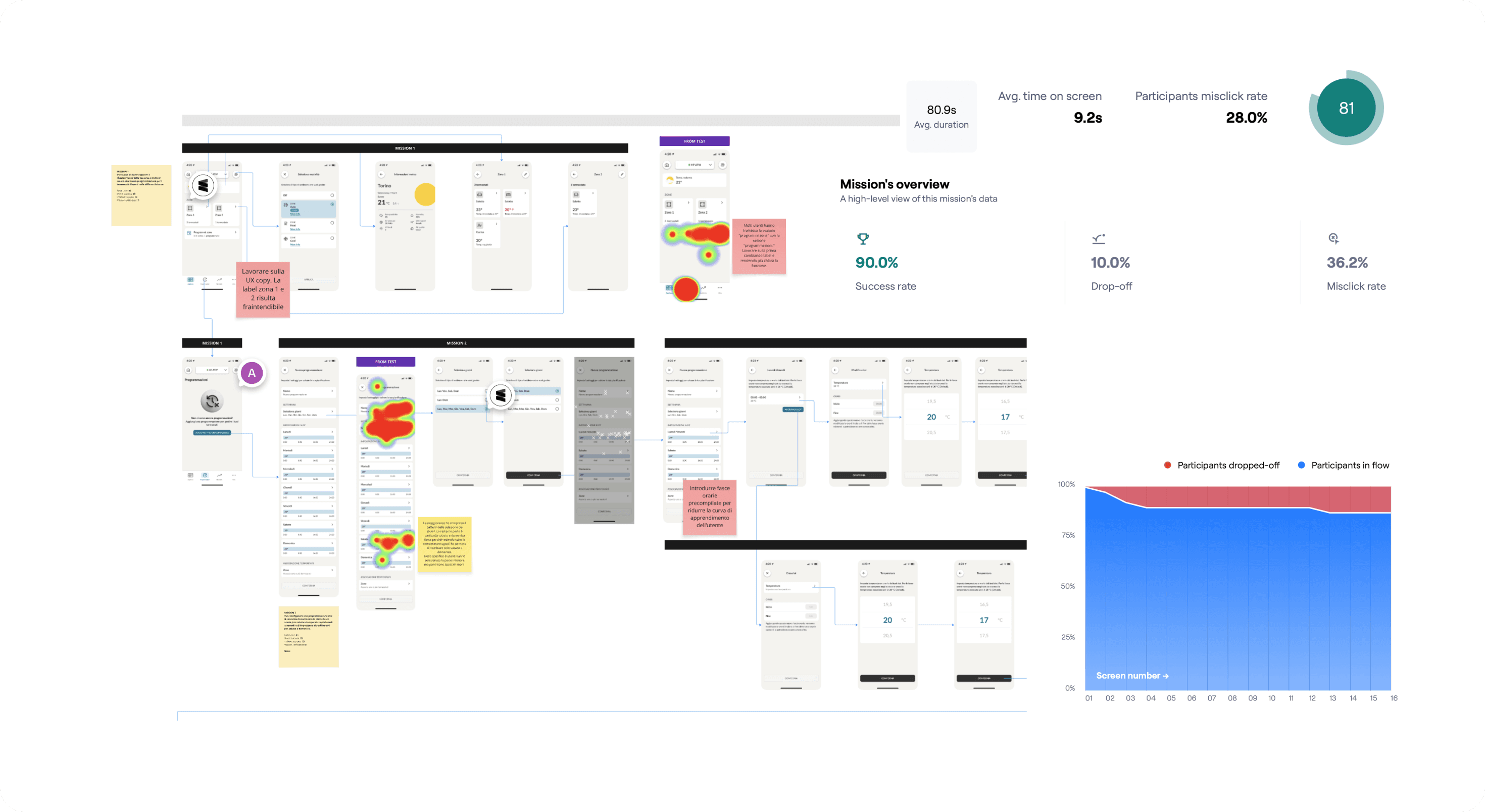
Both versions were fully prototyped in Figma and prepared for testing. Once the prototypes were completed, they were connected to Maze and structured with a series of guided tasks. Each task followed a clear, progressive flow to test specific interactions and decision points — from setting up a weekday routine to associating thermostats and managing exceptions.
The process - Phase 3
Launching the A/B test via Maze
We recruited 100 users and randomly split them into two equal groups. Each received an email with instructions and a unique test link. All tests were run asynchronously, and data was collected automatically.
Tasks were focused on real-life scenarios, such as:
Creating a weekday/weekend routine
Copying time slots
Assigning thermostats
The process - Phase 4
Analyzing results and mapping insights
We reviewed quantitative data (success rate, time on screen, misclicks, drop-offs, usability score) and qualitative inputs from open-ended questions and screen recordings.
We then clustered user feedback on Miro, identifying clear pain points and opportunities across both versions.
The process - Phase 5
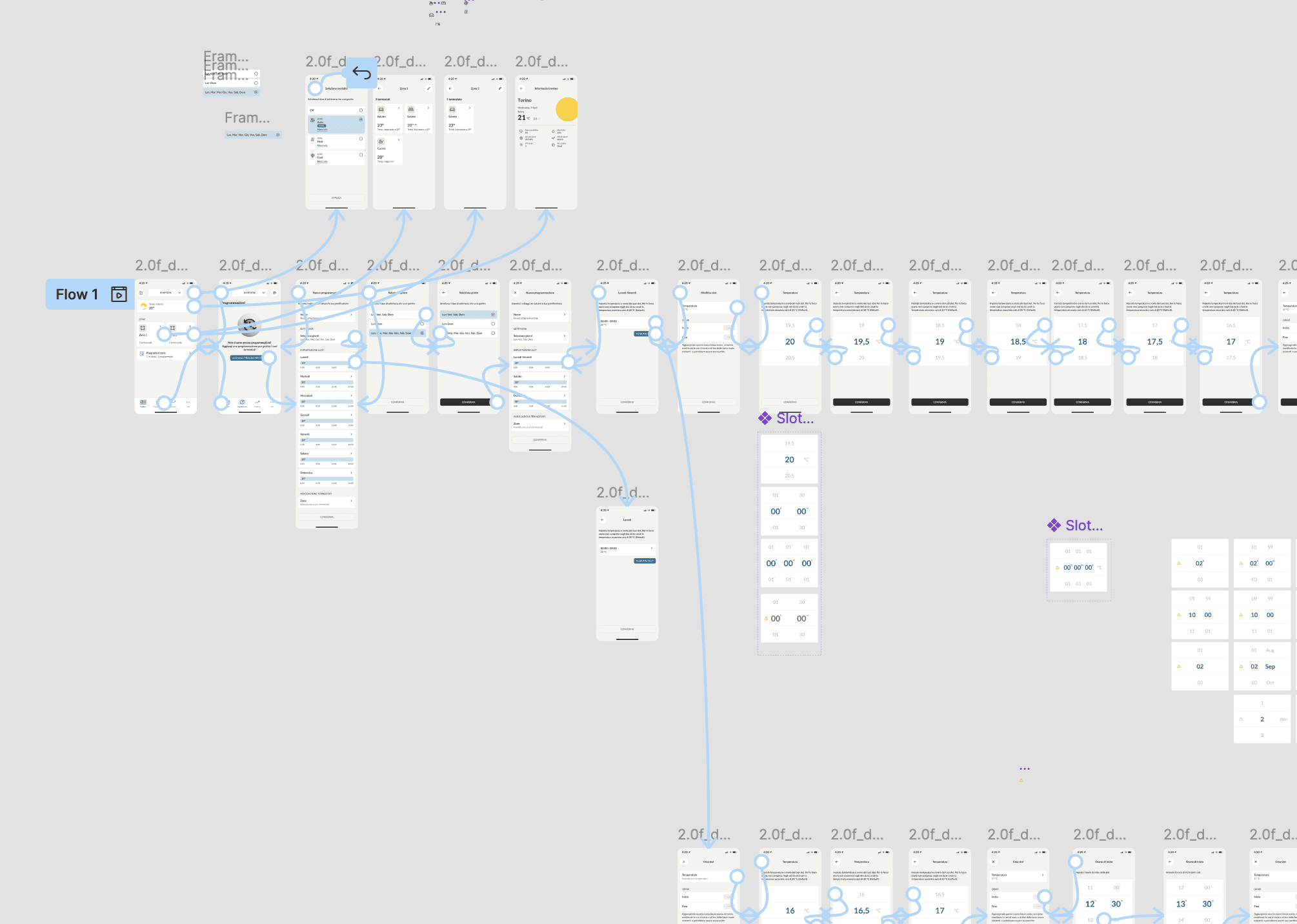
The final solution combined the strongest elements from both prototypes, refined through real user insights:
Thermostat selection repositioned
Moved to the top of the screen, reflecting users’ natural mental model: first where, then how.Copy & paste functionality added
From Version B — enabled quick duplication of daily settings across the week.Microcopy revised
Simplified and clarified labels and instructions based on user confusion.New guided flow introduced
A step-by-step scheduling assistant for less tech-savvy users:
“What time do you wake up?” → “What temperature do you want when you’re home?”
This generates a complete schedule without requiring manual input.
What changed
🧠 Improved mental model: users first think “where”, then “how” — now reflected in the flow
💡 Added flexibility with guided or manual scheduling options
💬 More intuitive UI copy, reducing friction and abandonment
🏆 Designed based on real behavior, not assumptions
What I learned
Designing something from scratch is already a challenge. But designing something complex and invisible — like a heating program — requires empathy, structure, and validation.
This project reminded me that asking the right questions to users can unlock clarity, and that A/B testing isn’t just about choosing a winner — it’s about building confidence in what we deliver. View the prototype