2024
Findomestic
Download app
What we achieved
We redesigned the Findomestic mobile app from the ground up, transforming it from a static banking product into a service-centric, value-driven platform.
Thanks to a complete UI overhaul and a scalable design system, the app now offers easier access to financial tools and support, empowering users with autonomy and flexibility. The new experience led to higher engagement and improved alignment with market standards.
My role in the journey
UX/UI Designer with a focus on the design system foundation and UI flows
Collaborated during strategic and discovery phases led by senior team members
Worked closely with developers and stakeholders in an Agile environment through multiple sprints
Tools: Figma, Miro, Jira
Where we started
Findomestic lacked a competitive mobile app compared to other players in the financial sector. The app had limited services, outdated UX, and was underutilized by users.
To respond to evolving customer needs and boost digital touchpoints, Findomestic partnered with Enhancers to rethink its mobile strategy and user experience. The objective: make the app useful, usable, and used.
The process - Phase 1
Benchmarking & Competitive Analysis
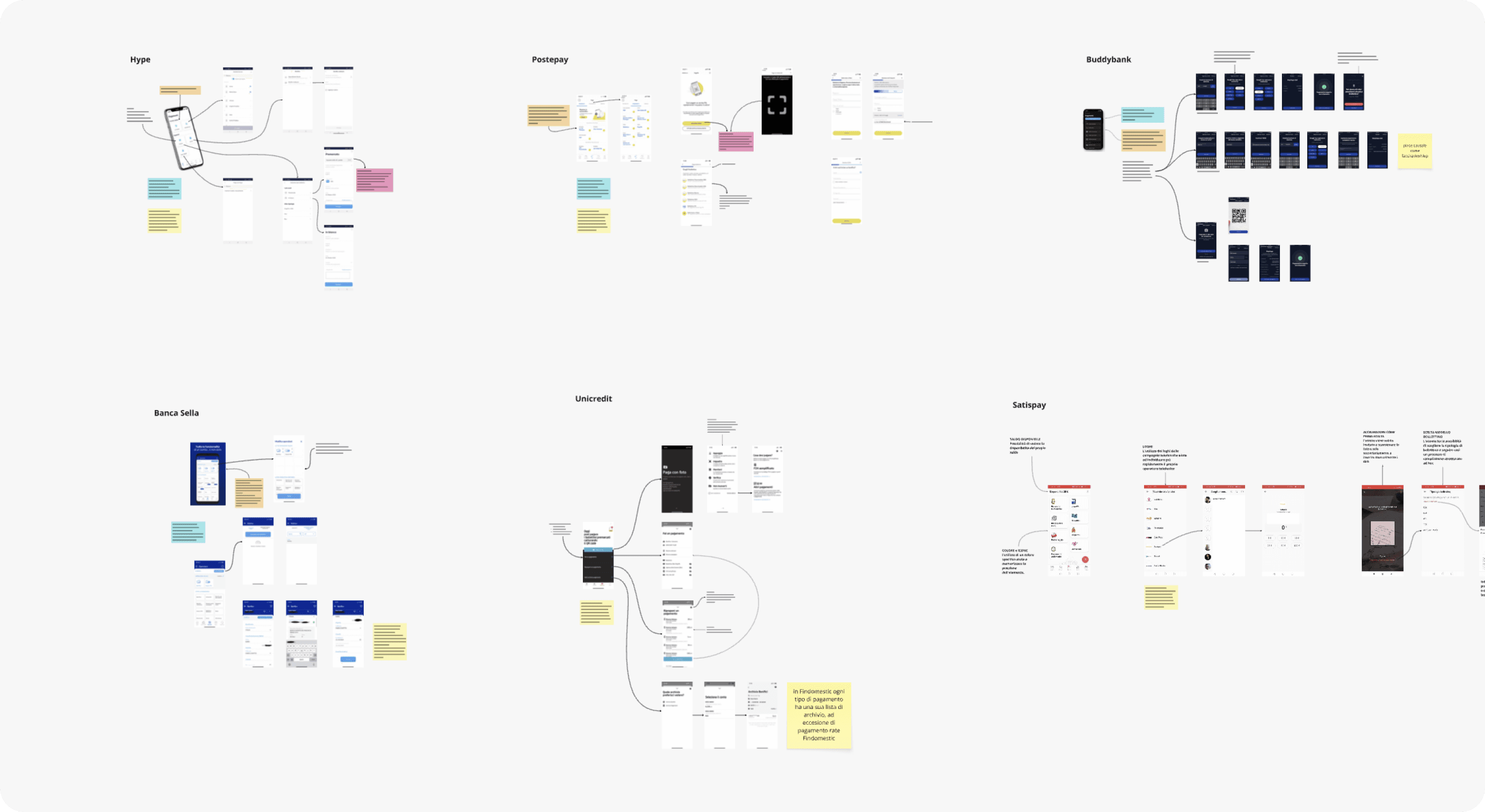
We started with a benchmark of leading banking and fintech apps to identify strengths, UX standards, and innovation opportunities. These insights guided early design directions and feature prioritization.
The process - Phase 2
Sketch Concepts & UI Proposals
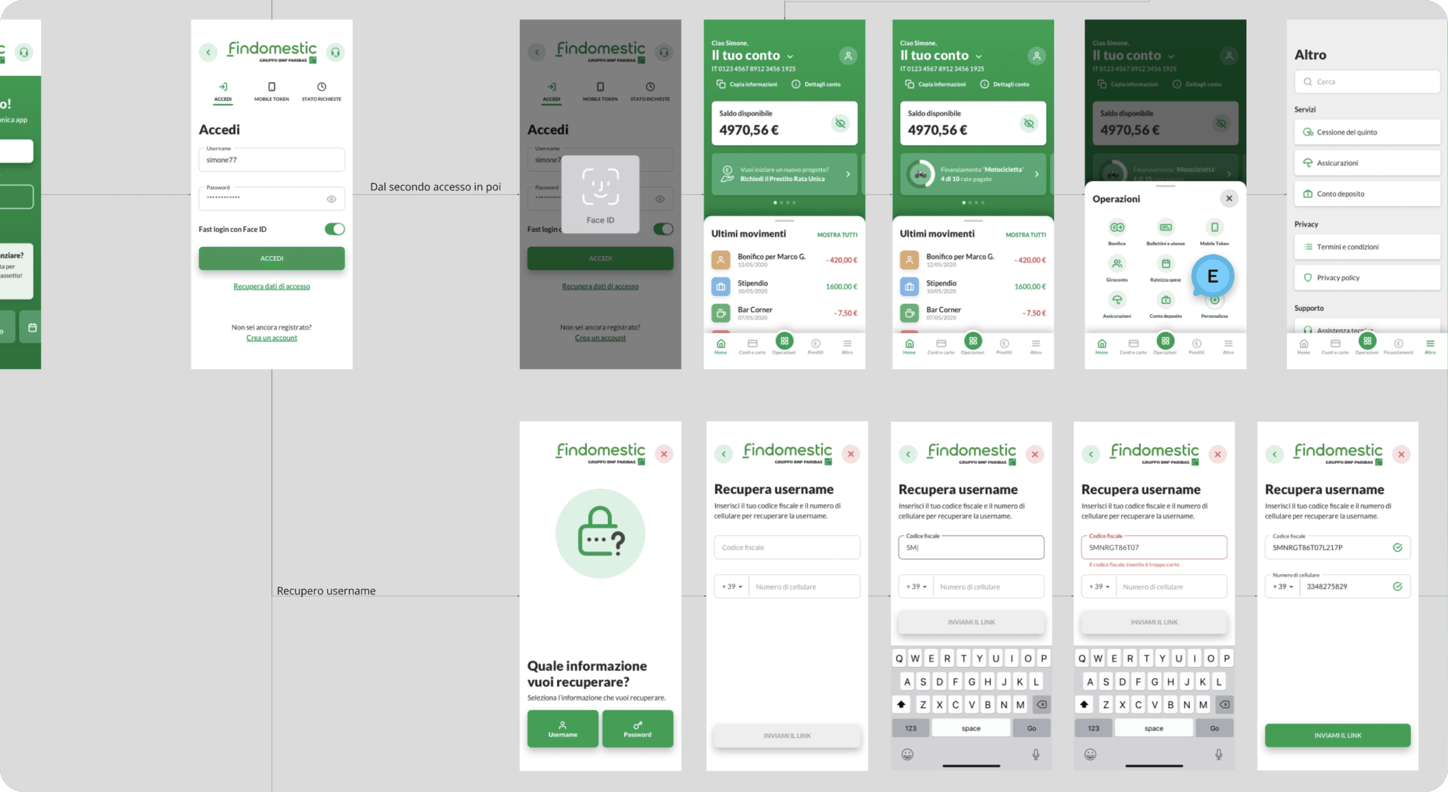
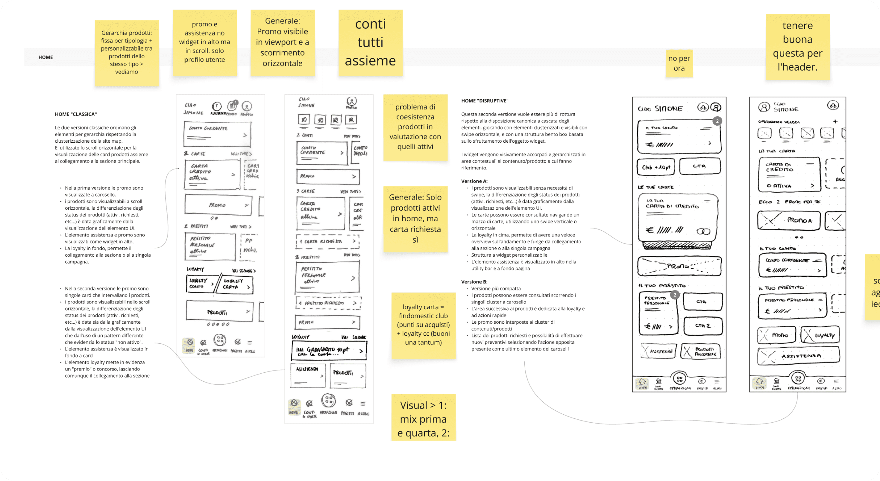
Based on business goals and benchmark outcomes, We developed hand-sketched concepts for the main flows. Once validated, we moved to high-fidelity UI proposals with a fresh, accessible, and consistent look.
The process - Phase 3
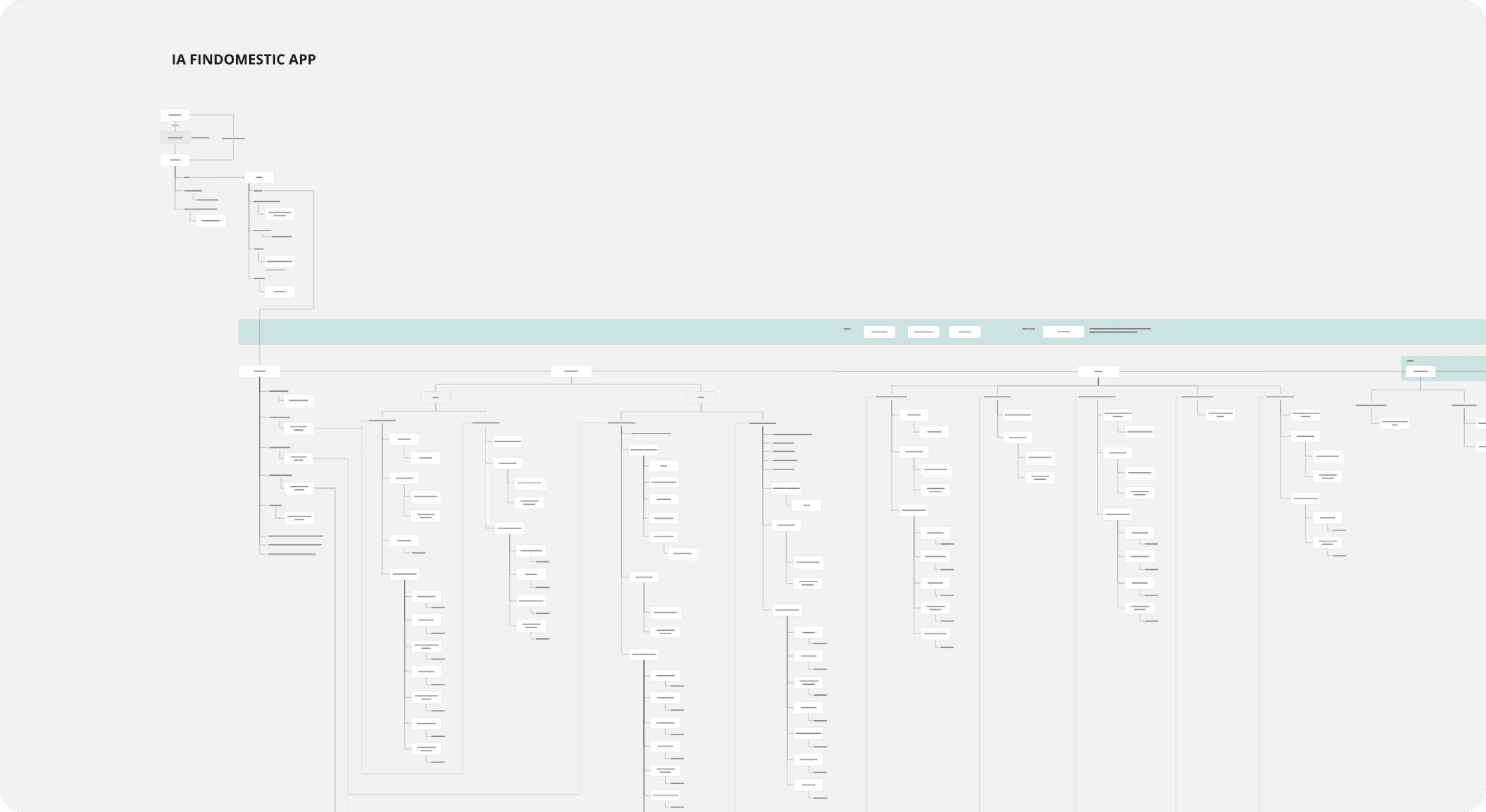
Information Architecture & Navigation Redesign
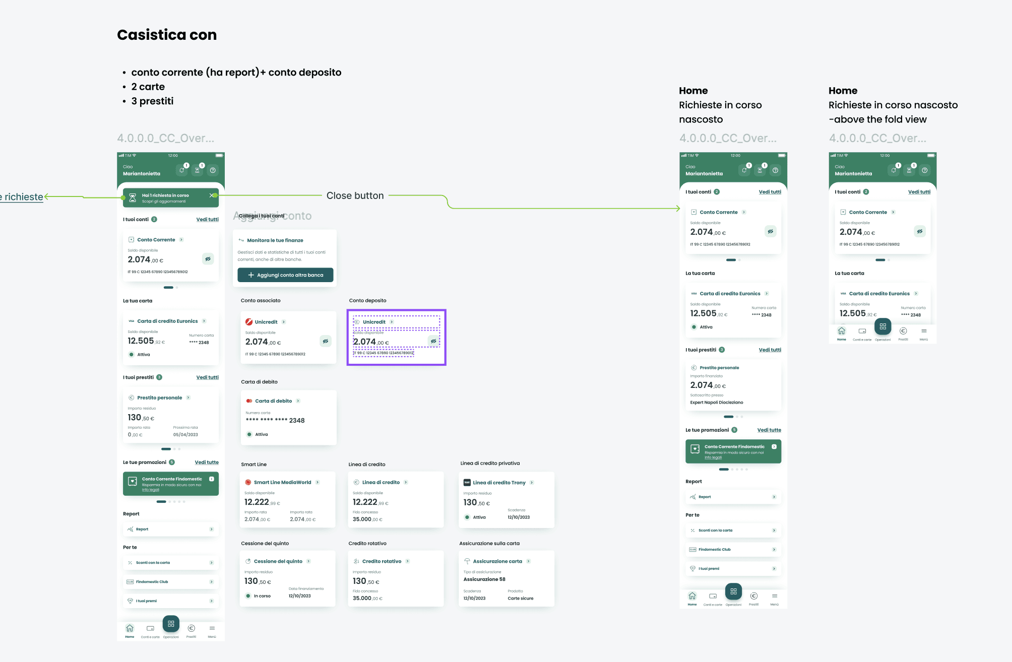
We revised the structure of the app to support service discovery and ease of access. Key functionalities—like changing installment dates or accessing support—were made more intuitive and centralized.
The process - Phase 4
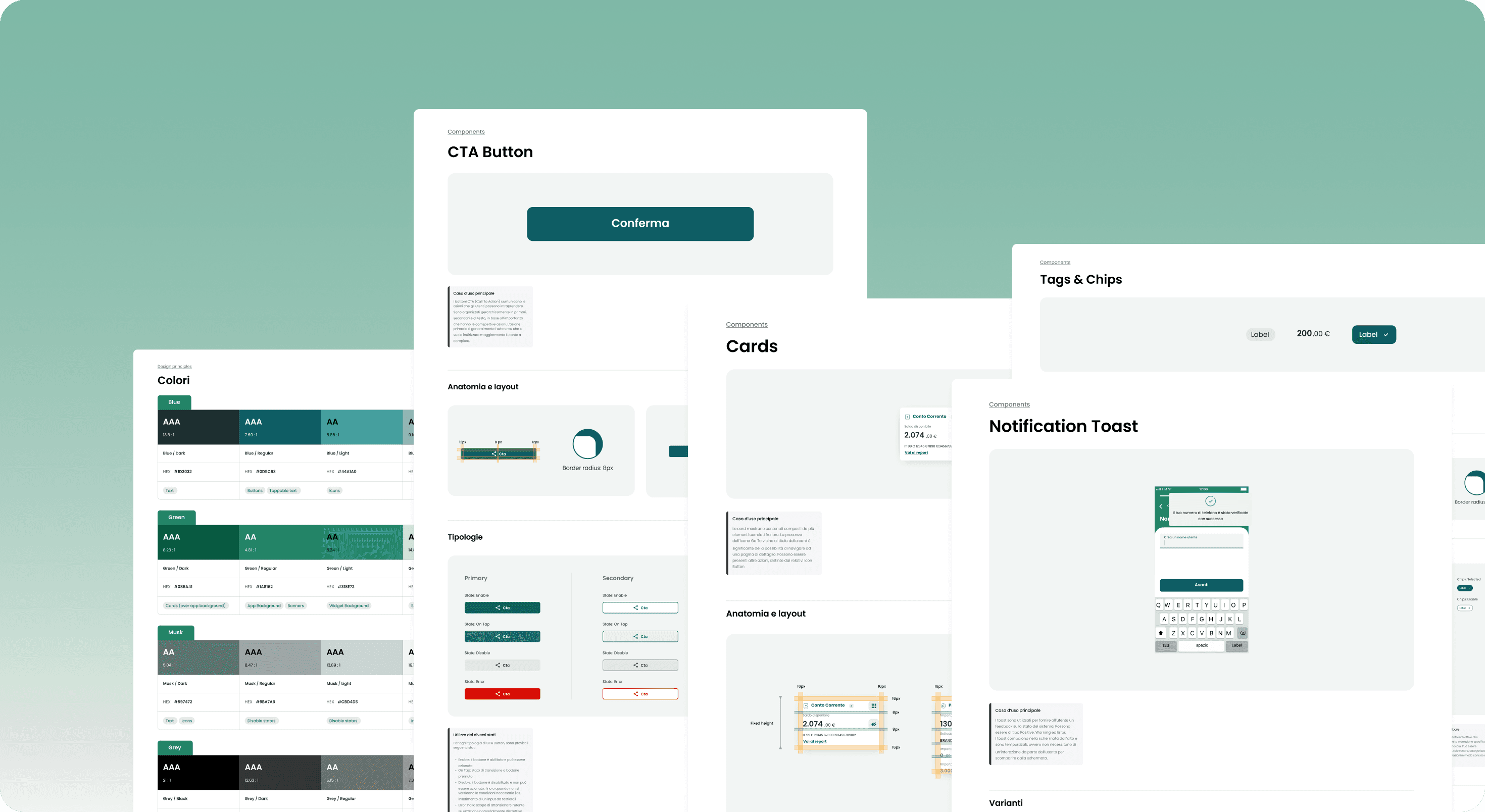
Design System Creation
I led the creation of a modular, scalable design system in Figma.
It includes:
Foundations: typography, color palette, iconography, spacing
Components: cards, forms, buttons, toasts, navigation, overlays
Variants & States: structured to support flexibility across flows
The process - Phase 5
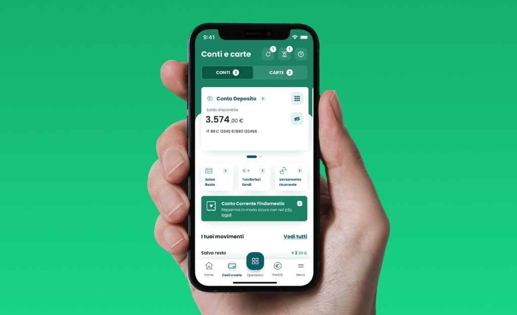
Full UI Redesign Across Flows
Using the new system, we redesigned the entire app: loan management, card settings, bill reimbursements, account overview, customer support, and more. All screens were optimized for consistency and accessibility.
What changed
📈 A more modern, user-centered app aligned with market standards
🔁 Increased frequency of app usage thanks to expanded service access
💬 Better self-service options, reducing pressure on customer support
🎯 Strong internal adoption of the design system across new feature development
🧩 Modular design system enabling scalable rollout over two years
What I learned
This project taught me how design systems can empower long-term evolution, especially in large-scale financial apps. Being part of a two-year transformation and focusing on UI quality and scalability gave me a deeper appreciation for the importance of consistency, governance, and collaboration.
Findomestic's evolution wasn’t just visual — it was strategic, and it shaped how design and development now work together.