2023
Illumia
View live project
What we achieved
We redesigned the full web onboarding and subscription experience for Illumia, one of Italy’s leading energy providers.
By rethinking the quoting system, order entry module, and public web area, we created a smoother, more guided user journey—enhanced with upselling and cross-selling logic.
The result: a more intuitive experience that aligns business goals with user expectations, and streamlines service activation. View the live project
My role in the journey
Junior UX/UI Designer involved in the entire redesign process
Tools: Figma, Miro
Where we started
Illumia operates in the open market of electricity and natural gas. The company needed a more effective digital experience to acquire customers online and maximize value per user.
The existing process was fragmented, visually outdated, and lacked strategic nudges to encourage product upgrades.
The process - Phase 1
Competitive Benchmarking & Design Principles
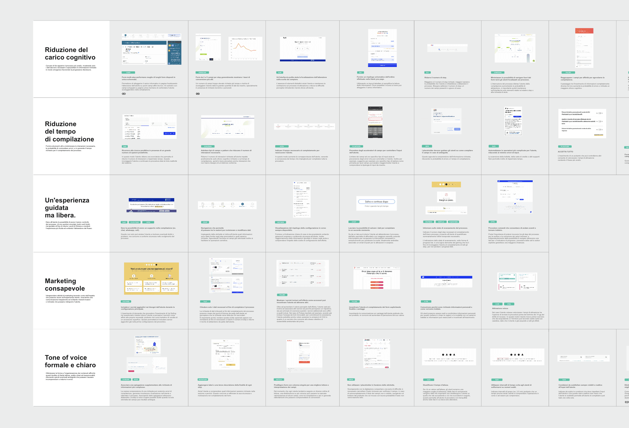
We began with an in-depth benchmark and we conducted a step-by-step comparison of each competitor’s subscription process. This was crucial to identify user pain points, particularly around the length and complexity of contract activation flows. The insight was clear: too many steps caused user frustration and increased drop-off.
From this analysis, we defined a set of guiding principles: simplicity, transparency, progressive disclosure, and contextual support.
The process - Phase 2
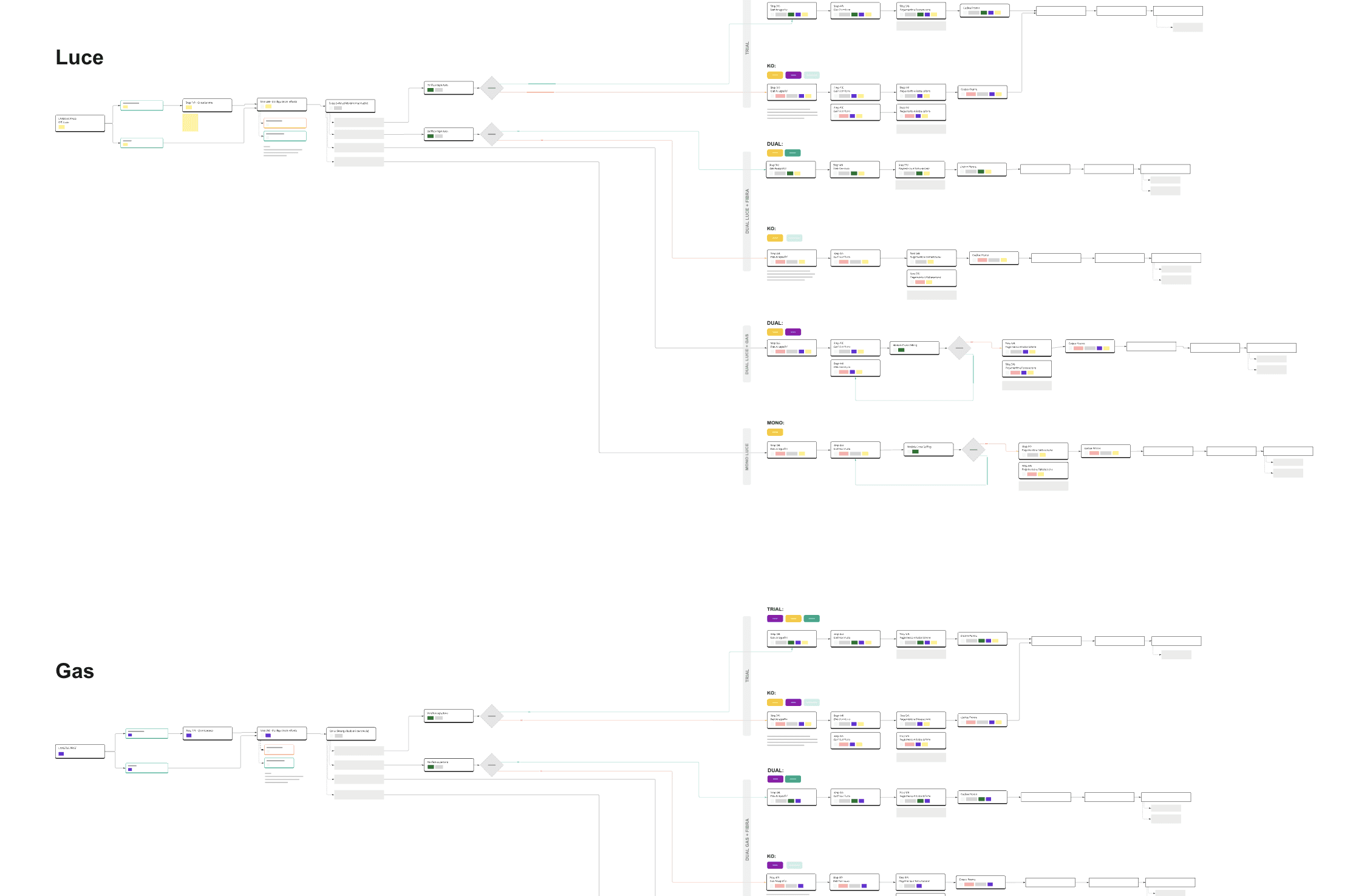
User Flow Mapping
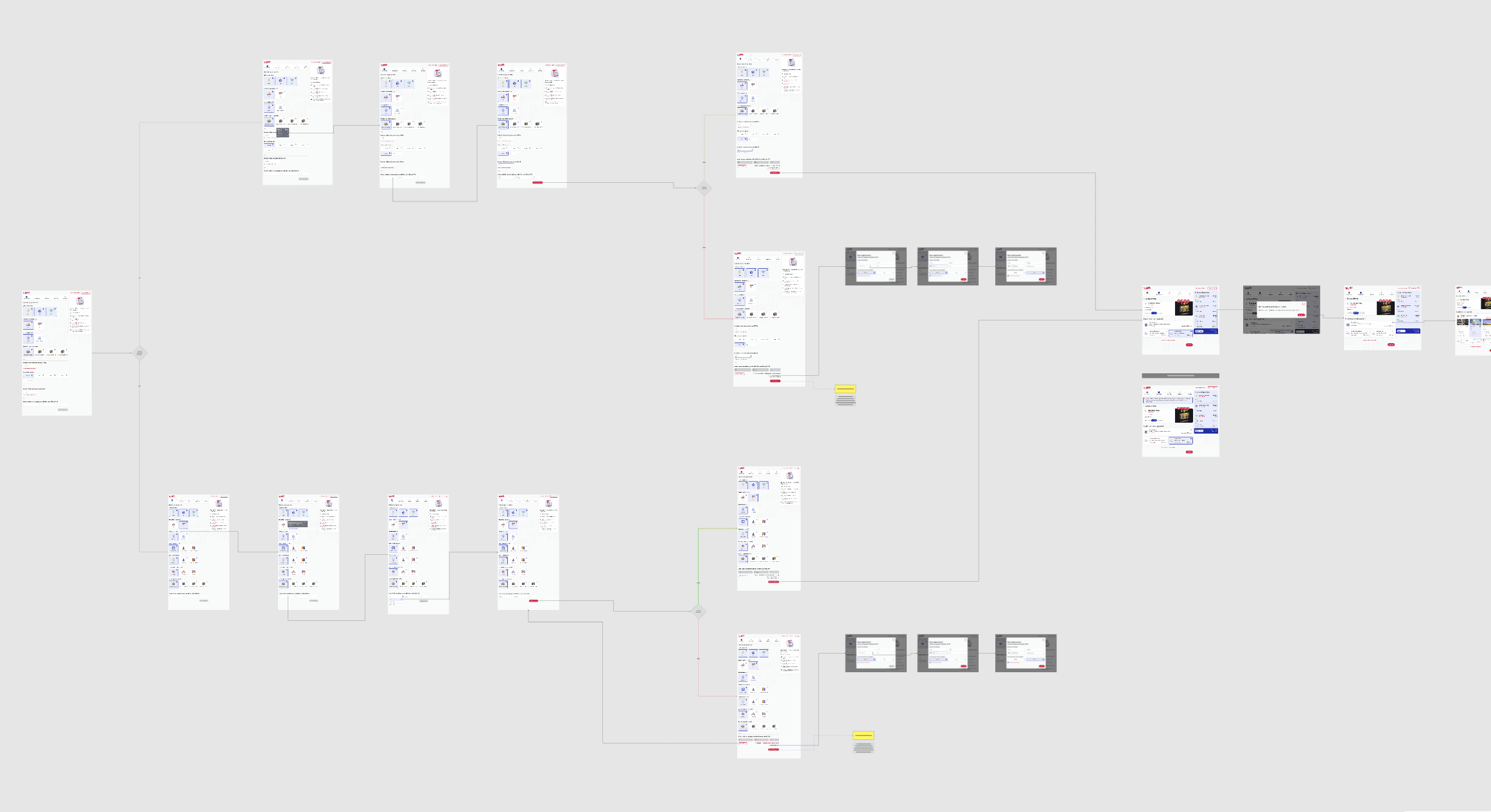
I created detailed user flows to visualize how users move through the onboarding journey based on their inputs and configurations. This helped us structure a dynamic experience that adapts to the user’s context — whether residential or business, single or dual utility, etc.
The process - Phase 3
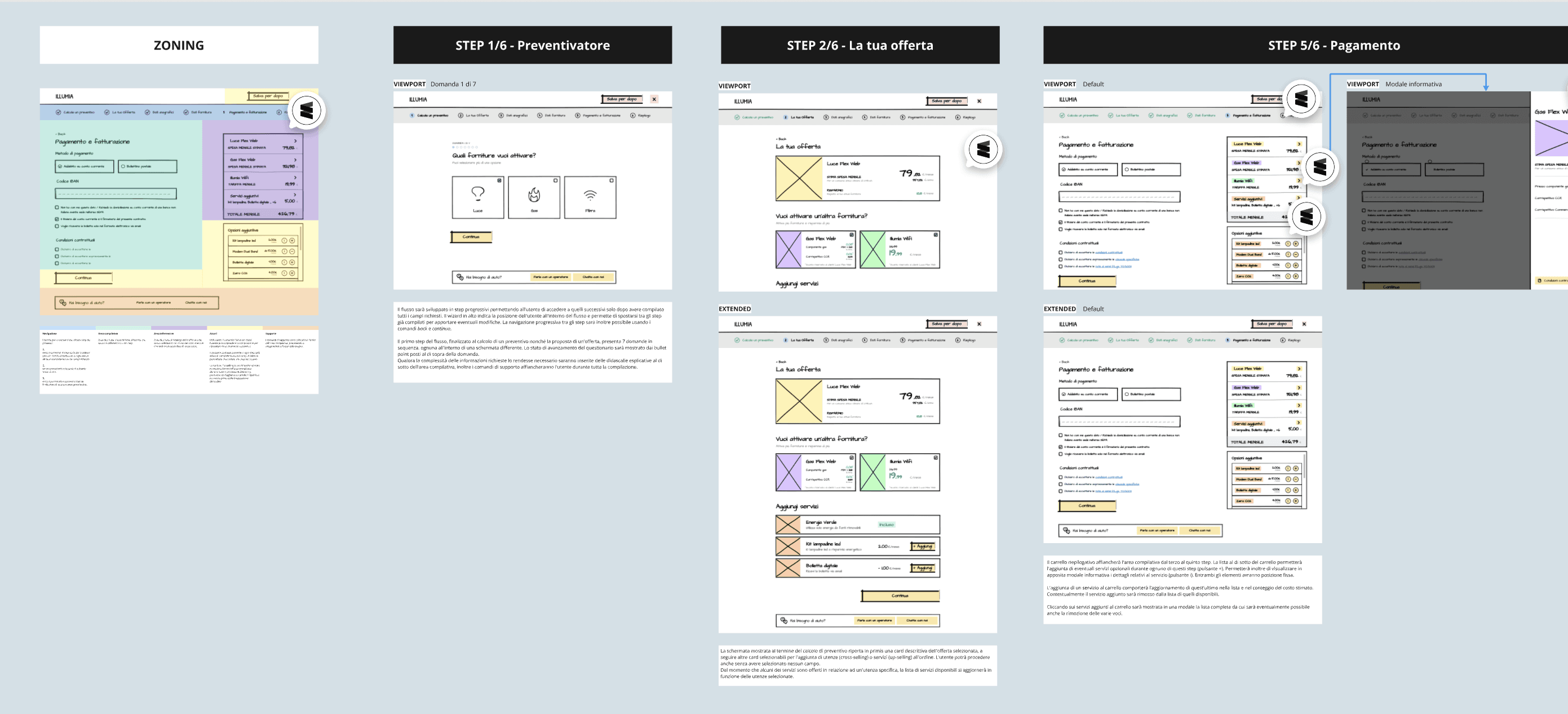
Sketching & Zoning
We explored early layout ideas with hand-drawn concepts and zoning maps for both desktop and mobile, focusing on readability, flow segmentation, and opportunities for upselling without disruption.
The process - Phase 4
Visual Style Exploration
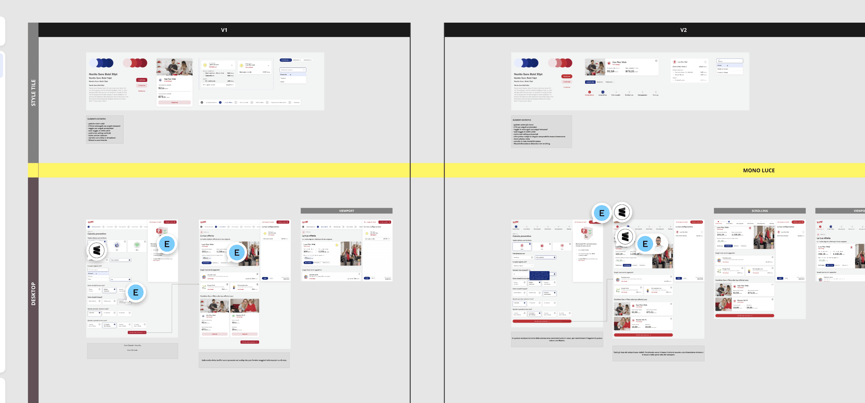
To define the right tone for Illumia’s digital identity, we developed three distinct UI proposals, each with its own color palette, iconography, typography, and visual style. These explorations helped the client clarify the desired perception: modern, accessible, and trustworthy — yet not overly corporate or cold.
The process - Phase 5
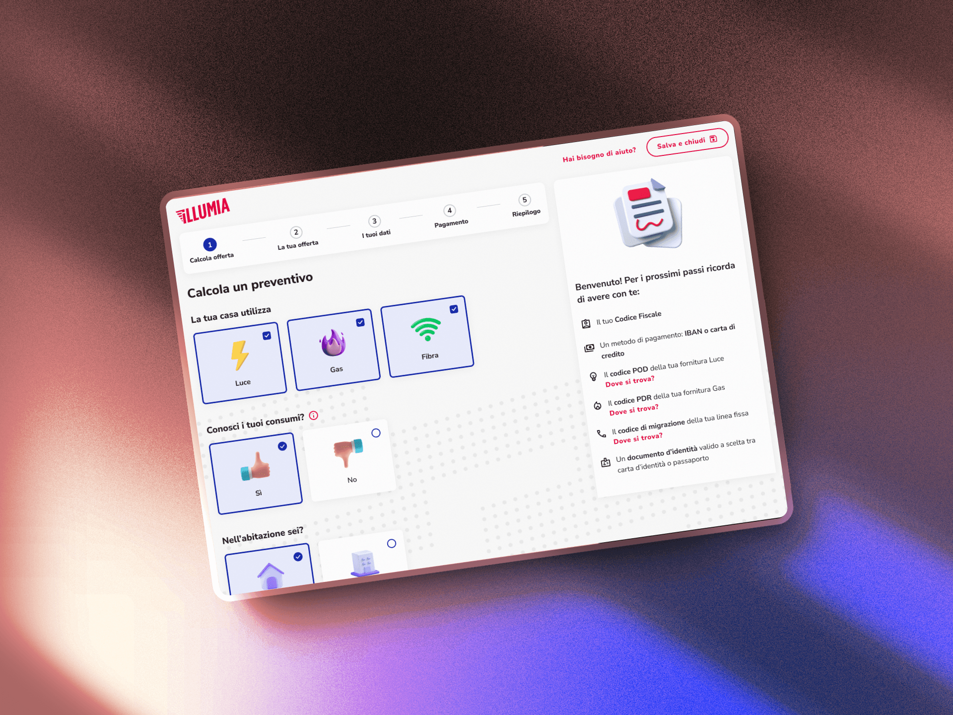
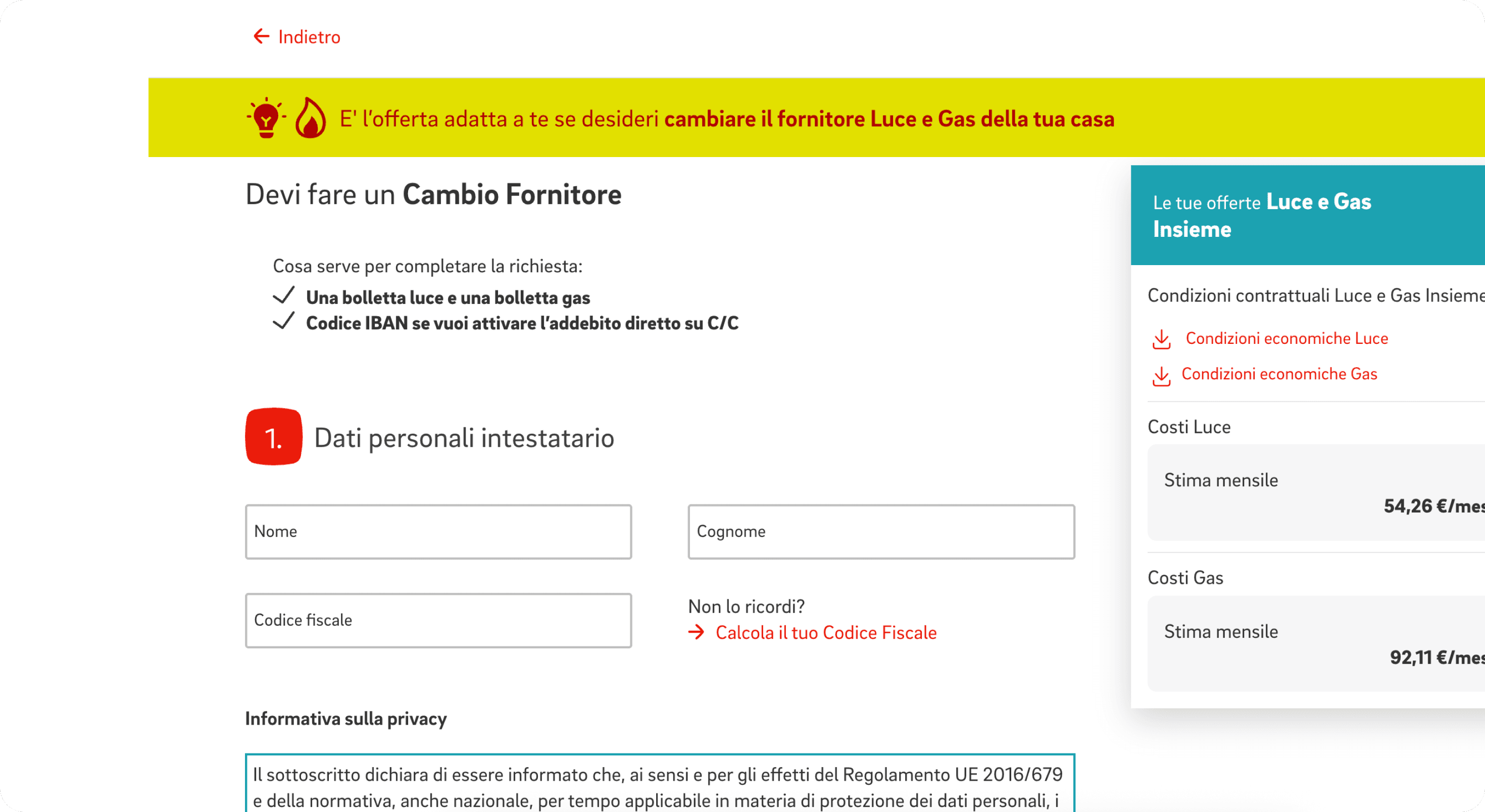
UI Design of All Flows
I then translated the approved flows and sketches into high-fidelity UI screens. The redesign included:
A new public site area to introduce offers and guide conversion
An integrated quoting tool with upsell/cross-sell modules
A modular order entry system designed for clarity and scalability
The contract review and confirmation interface
What changed
✅ Streamlined subscription process with a number of steps equivalent to the most efficient competitor
🔁 Dynamic configuration adapting to user inputs
💸 Enhanced upselling and cross-selling through contextual offers
💬 Improved brand perception via clearer, more transparent flows
What I learned
This project showed me the power of aligning business and user needs within a clear, decision-oriented experience. From defining design principles to translating them into a fully responsive UI, it was a great example of how structure and empathy go hand-in-hand to drive meaningful results. View the live project