2025
Leading IoT Brand (under NDA)
By request
What we achieved
I led the migration of a complex smart home app UI from a fragmented Sketch environment to a robust and scalable design system in Figma.
The result was a 75% reduction in UI components and a unified visual language. I implemented a rigid shared language through design tokens, centralizing visual values and logic across design and development, ensuring full alignment.
Today, all design is standardized, versioned, and documented, enabling clearer handoffs and a significantly more efficient product workflow.
My role in the journey
Design System Owner: audited the existing UI, identified component patterns, and led system architecture
UI Designer: redesigned and optimized components for clarity, consistency, and reusability
Process Facilitator: collaborated across teams to align design and dev workflows
Tools: Figma, Sketch, Confluence, Jira, Miro
Where we started
The project started with a clear pain point: inconsistency. The existing Sketch library had no rules. Designers created and modified components locally, resulting in a patchwork of screens and duplicated patterns across a large-scale smart home app used by millions of users worldwide.
We were facing a lack of governance, no single source of truth, and growing friction between design and development teams.
The process - Phase 1
Audit & Analysis
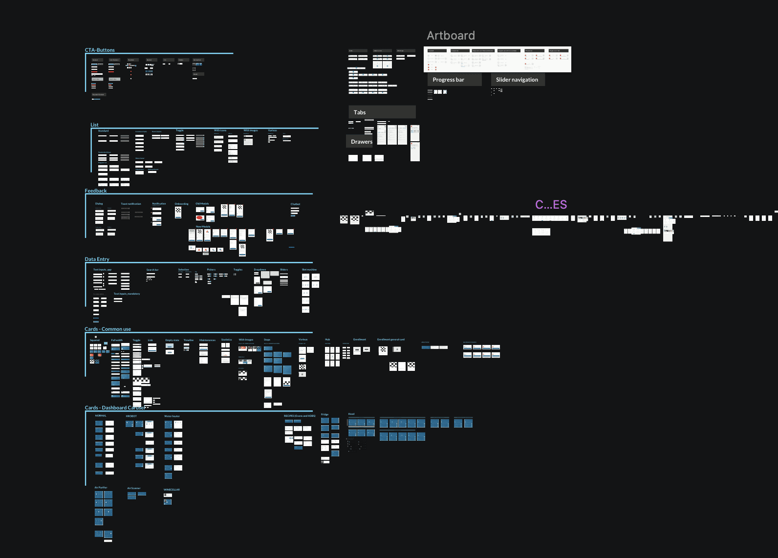
I began by auditing all existing screens and components — over 250 tile variants in the Sketch library. I mapped UI patterns, identified inconsistencies, and clustered related elements to highlight redundancies.
This analysis enabled me to propose rational groupings and early unification strategies, paving the way for a more scalable and consistent system.
The process - Phase 2
Pattern Reduction & Consolidation
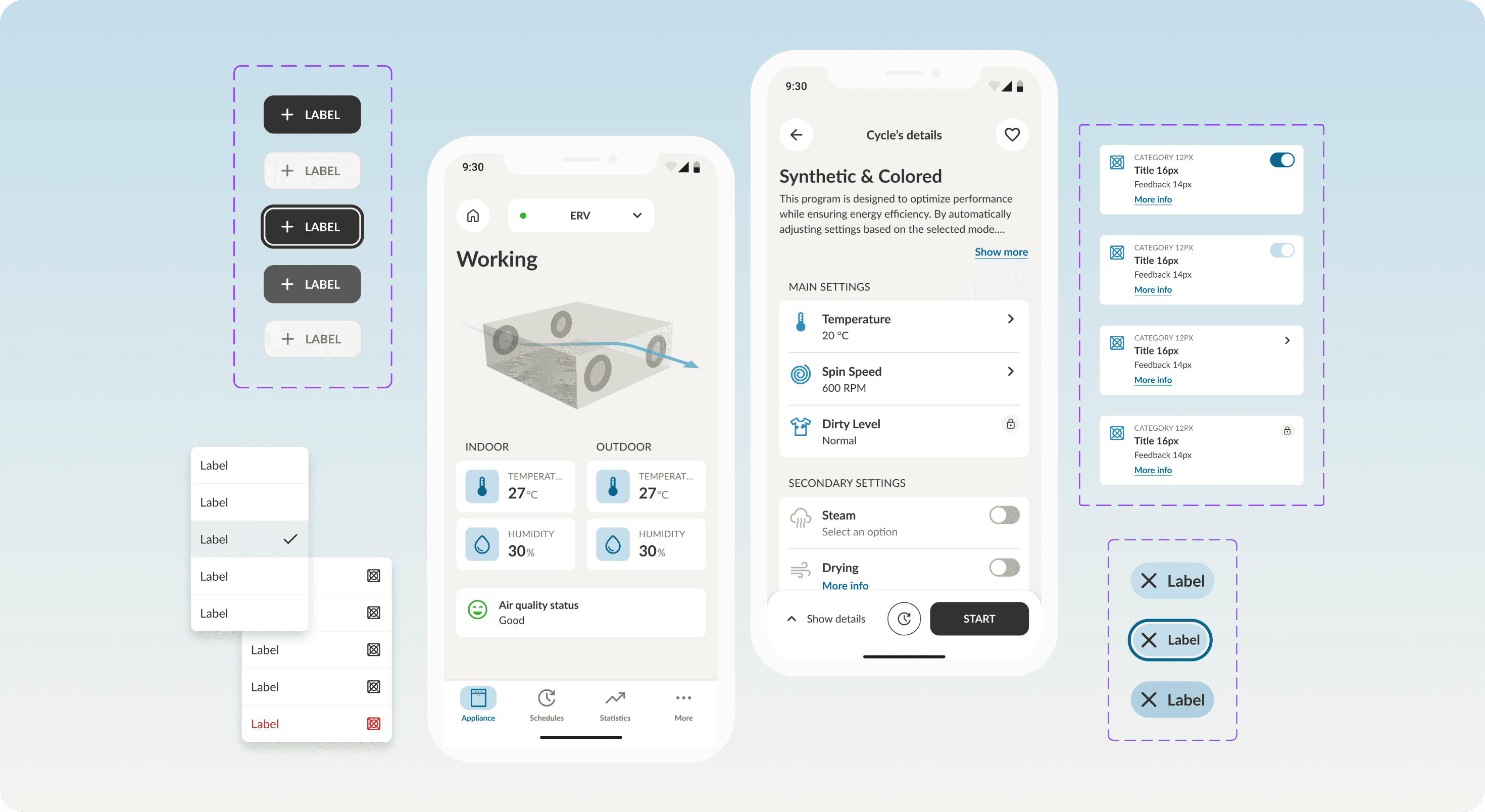
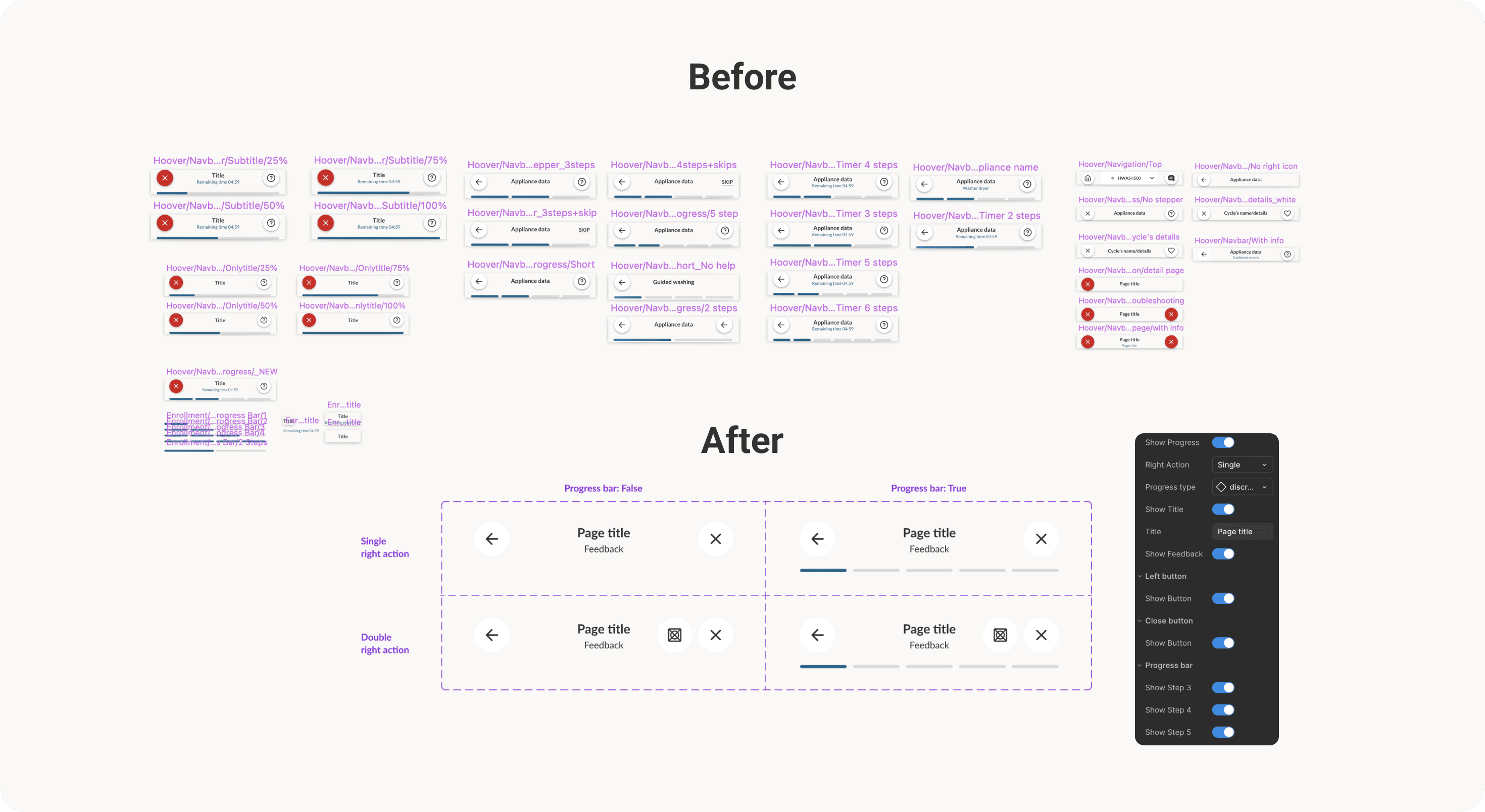
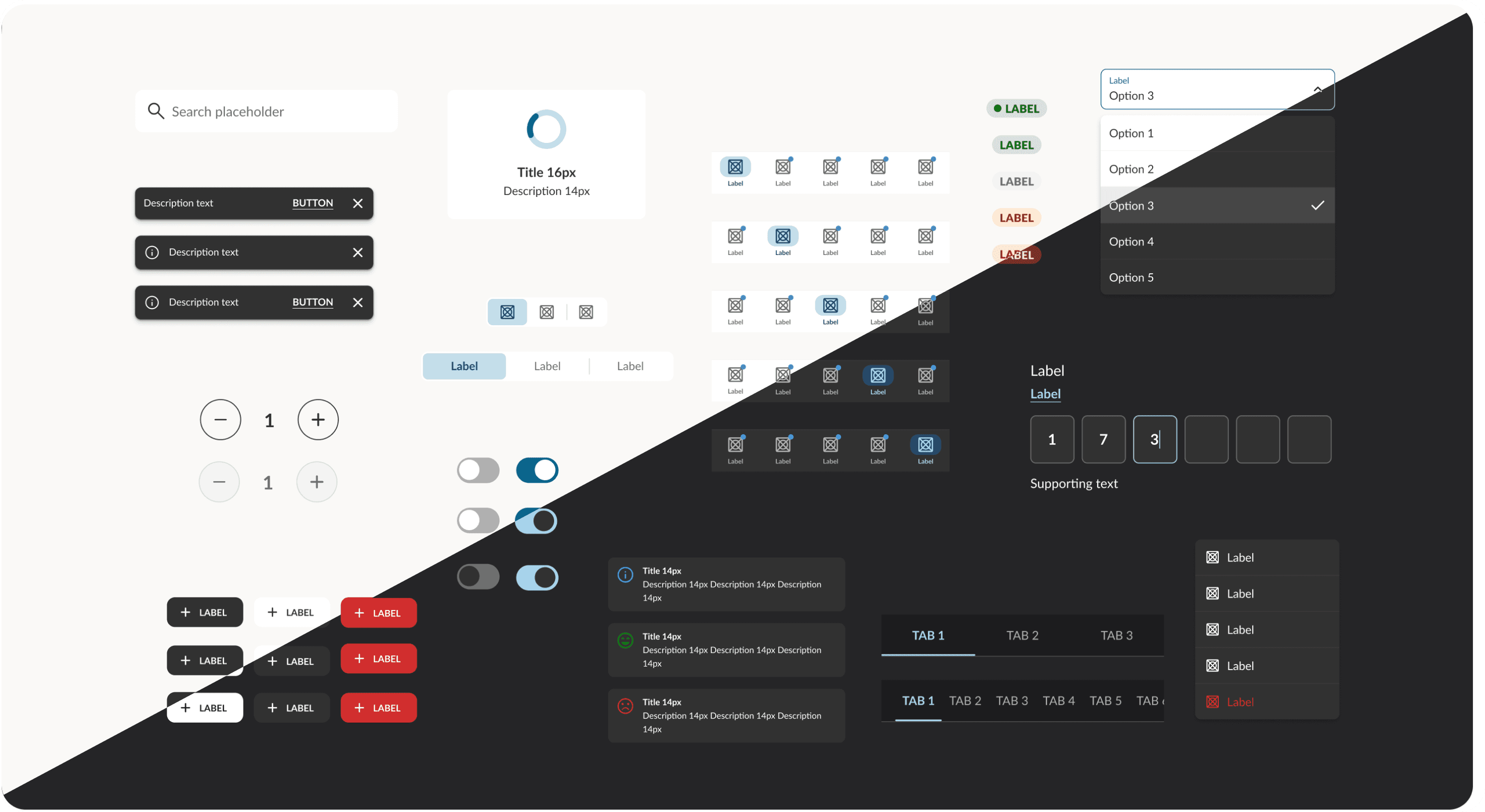
We streamlined redundant patterns by consolidating fragmented components into scalable, flexible foundations. For example, the navigation top bar, once split into dozens of inconsistent versions, was restructured in Figma as a single base component.
Thanks to a reduced set of variants and customizable instances, designers can now toggle elements like progress bar, title, feedback text, or icons — all within one unified system.
The process - Phase 3
Component System in Figma
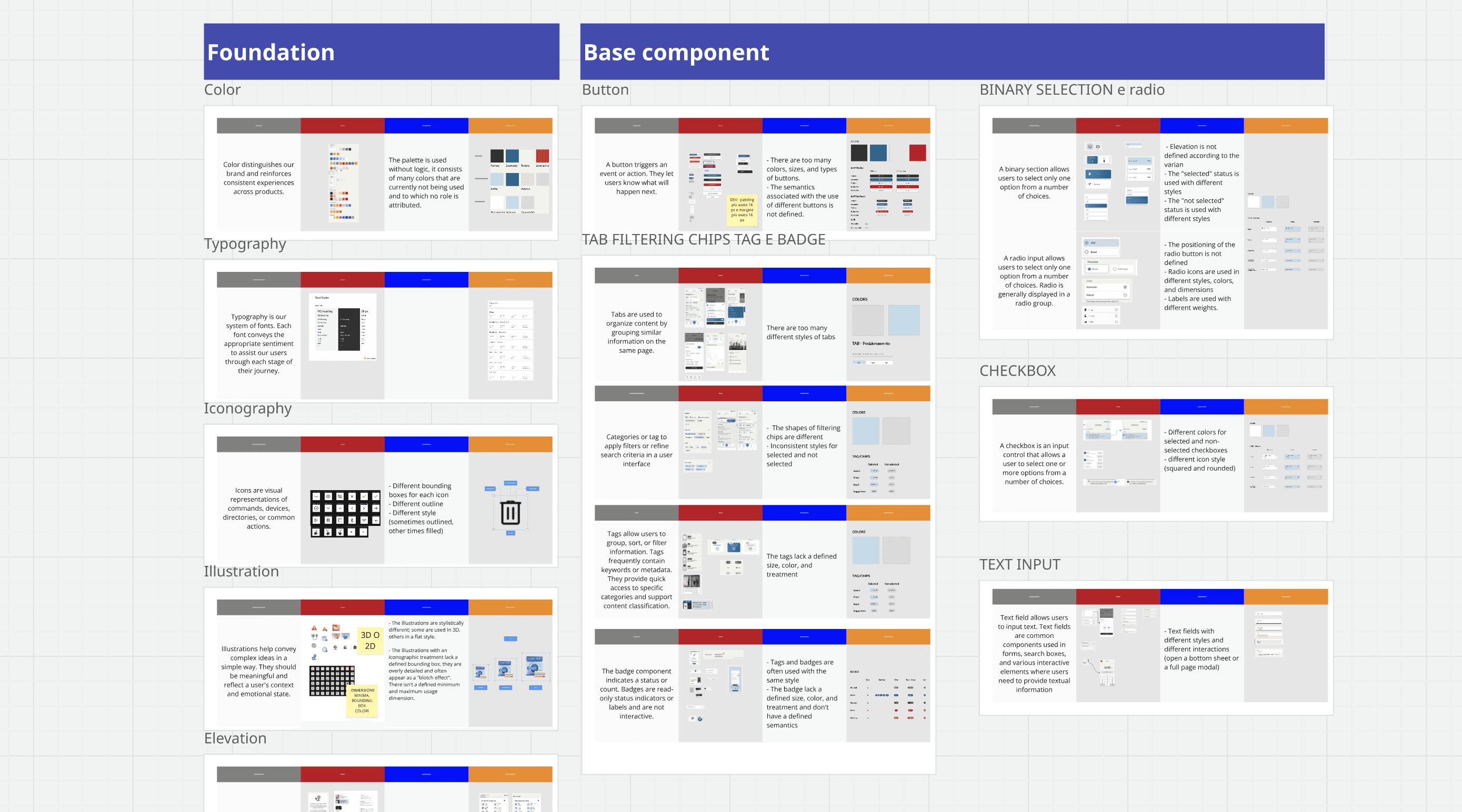
The system follows Atomic Design principles, organizing components into Atoms, Molecules, Organisms, and Templates. I structured the design system in Figma using tokens and variables to ensure flexibility and reusability.
Design tokens are organized into three levels:
Primitive Tokens (e.g.
pri.color.blue.100) store raw values like colors, spacing, and typography.Semantic Tokens (e.g.
sem.color.indicator.primary) reference primitives based on context — for example, in dark mode they automatically point to different primitives, enabling full theme switching by editing only the palette.Component Tokens (e.g.
comp.button.primaryBrand.background) apply styles to UI elements with consistency and flexibility.
The process - Phase 4
Documentation & Adoption
I wrote clear, developer-friendly documentation in Confluence and helped onboard the team to the new system. This improved adoption across both the design and front-end teams.
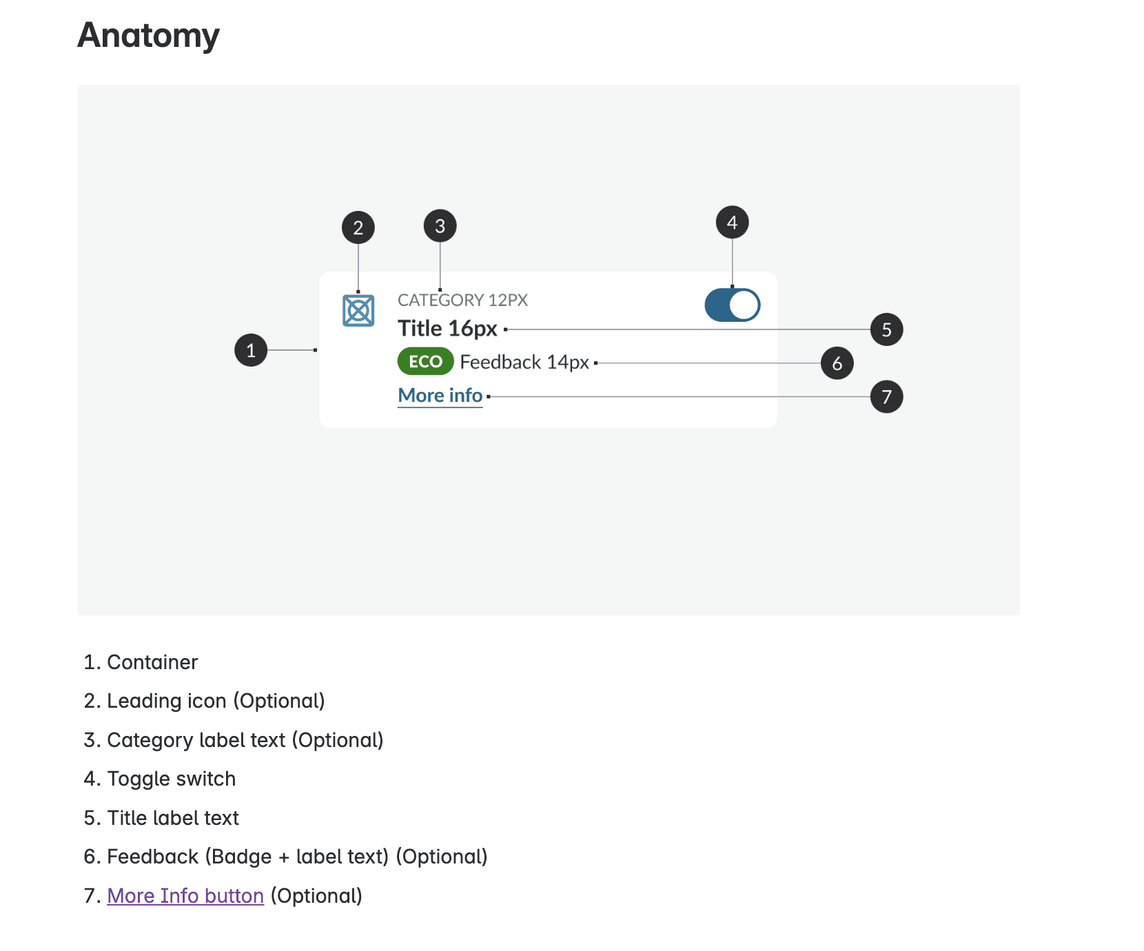
The documentation is structured into six key sections to ensure clarity and consistency: Anatomy, Behavior, Patterns, States, Design Specs and Usage (Do & Don’ts).
The process - Phase 5
App Redesign & Migration
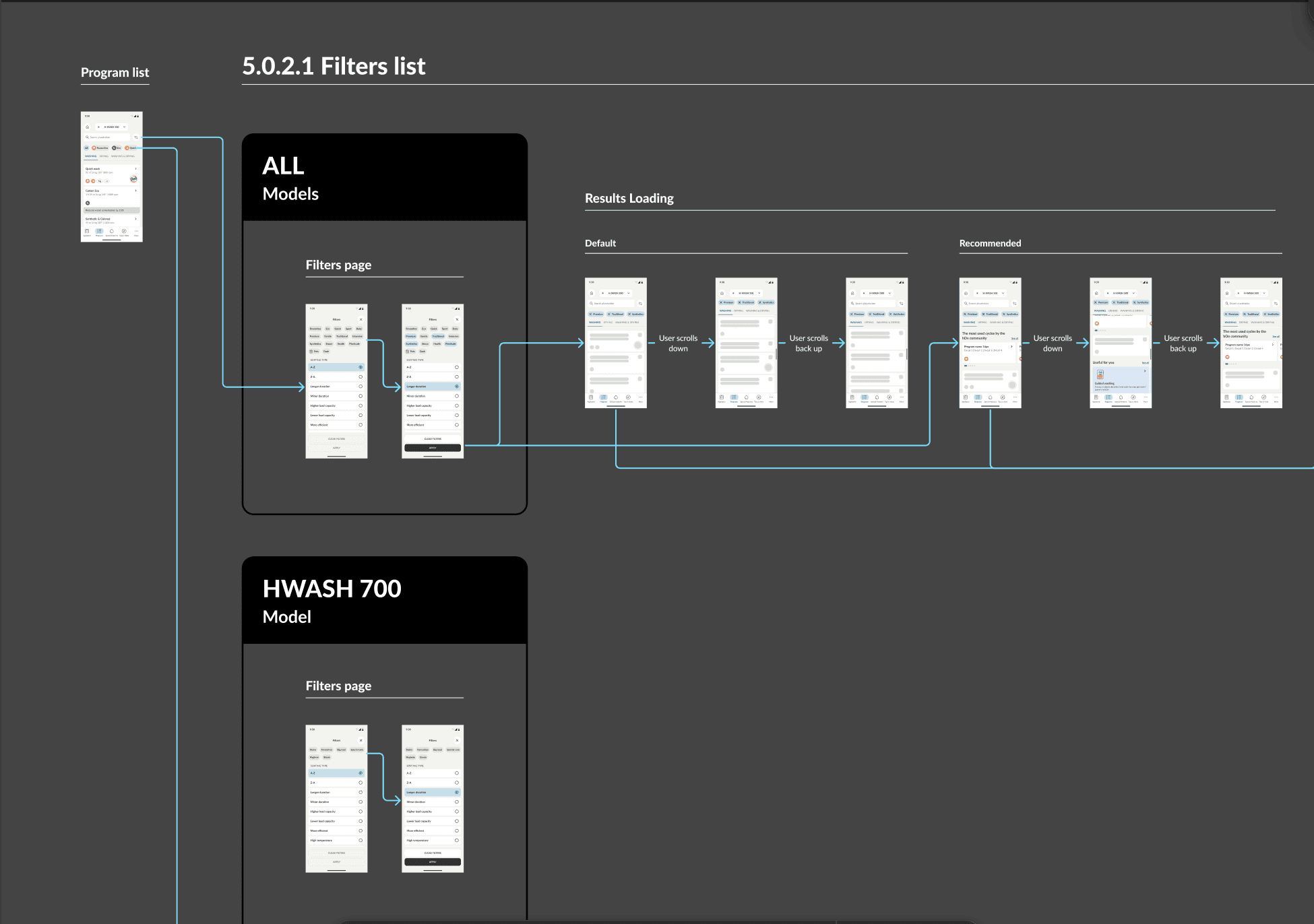
We initiated the migration of all app flows using the new components. It was like building a new app on top of the existing backend—same logic, new clarity. Previously, flows and specs lived across three platforms: Sketch, Miro and Zeplin: Now, everything lives inside Figma, following a structured folder system.
What changed
−75% in component count → easier to maintain and scale
Faster onboarding for new designers
Smoother handoff to development thanks to a shared language and token-driven structure
Clear developer guidance → no more guessing: developers now work with precise, systematized values
Faster iterations → any update to a token or component is instantly reflected across both design and code
Future-proof scalability → ready to support new features and product growth with minimal design debt
What I learned
This was one of the most impactful projects I’ve worked on, not just in terms of UI, but in shaping how our team collaborates. It taught me that design systems aren’t just about components, but about trust between teams, clarity of intent, and the invisible glue that holds a product together. It helped us move from design chaos to a structured, scalable, and future-proof system.